
I have compiled (in no particular order) a few of my high-level projects during my tenure at Rocket Companies. Due to NDA and lack of ability to display certain artifacts, I've narrowed content down to highlight the most important elements of the experience and work. Feel free to inquire about more details.

🔐 MFA

OVERVIEW:
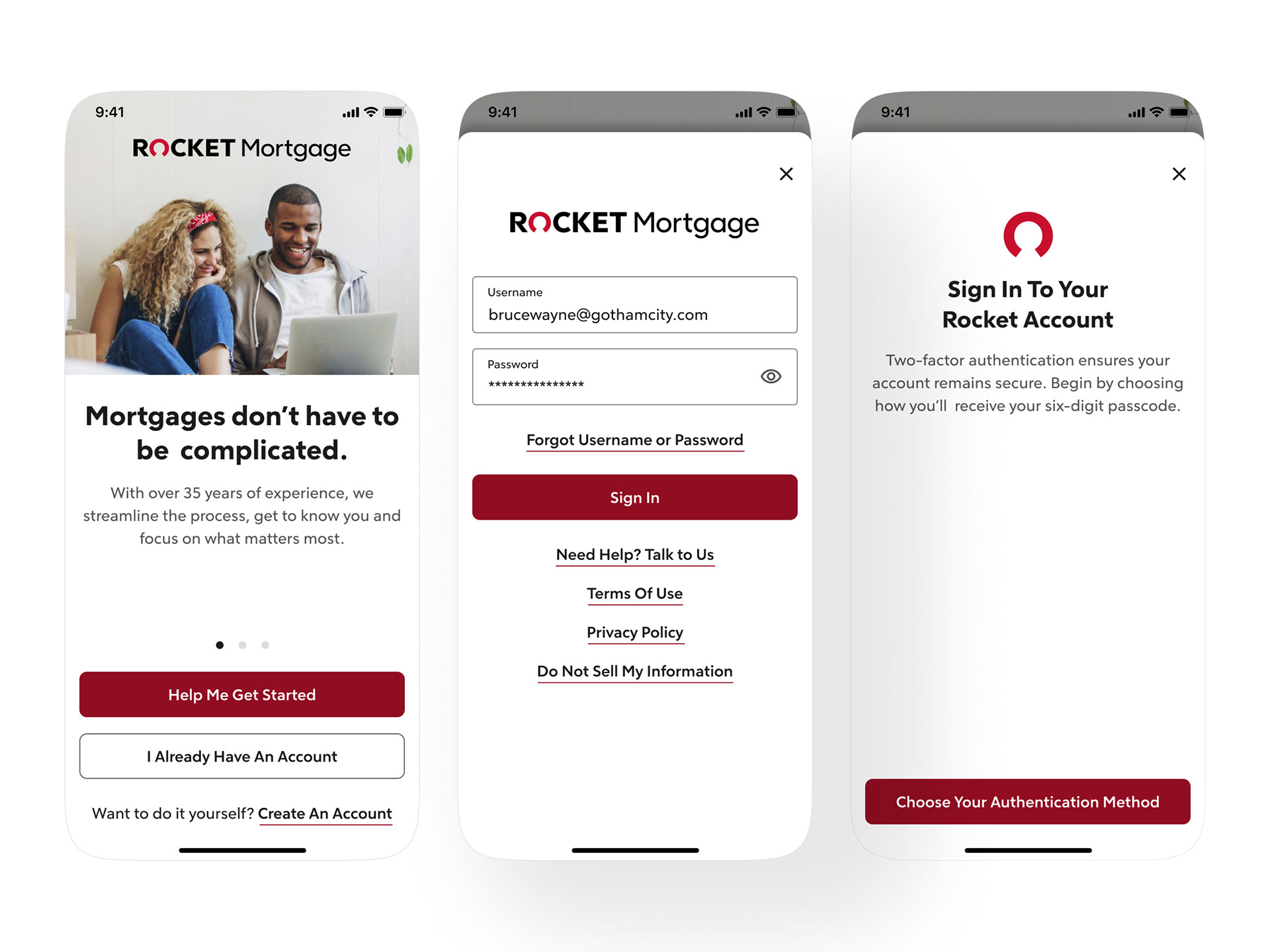
There was a mandate passed to enforce multi-factor authentication (MFA) within applications that obtain financial data. At the time, Rocket didn’t use MFA, but in order to stay complaint we had to act fast. Business also wanted improve the biometric enrollment from 60% -to- 90% for added security across both iOS and Android platforms.
_
👋 MY ROLE: Principal UX Designer
WHO I WORKED WITH: Product Owners, Copywriter, Engineers, Product Teams (Rocket Homes + Rocket Money), Web Design Team
PROJECT DURATION: 2-4 weeks
TOOLS: Pen + Paper, Figma, Mural, Jira
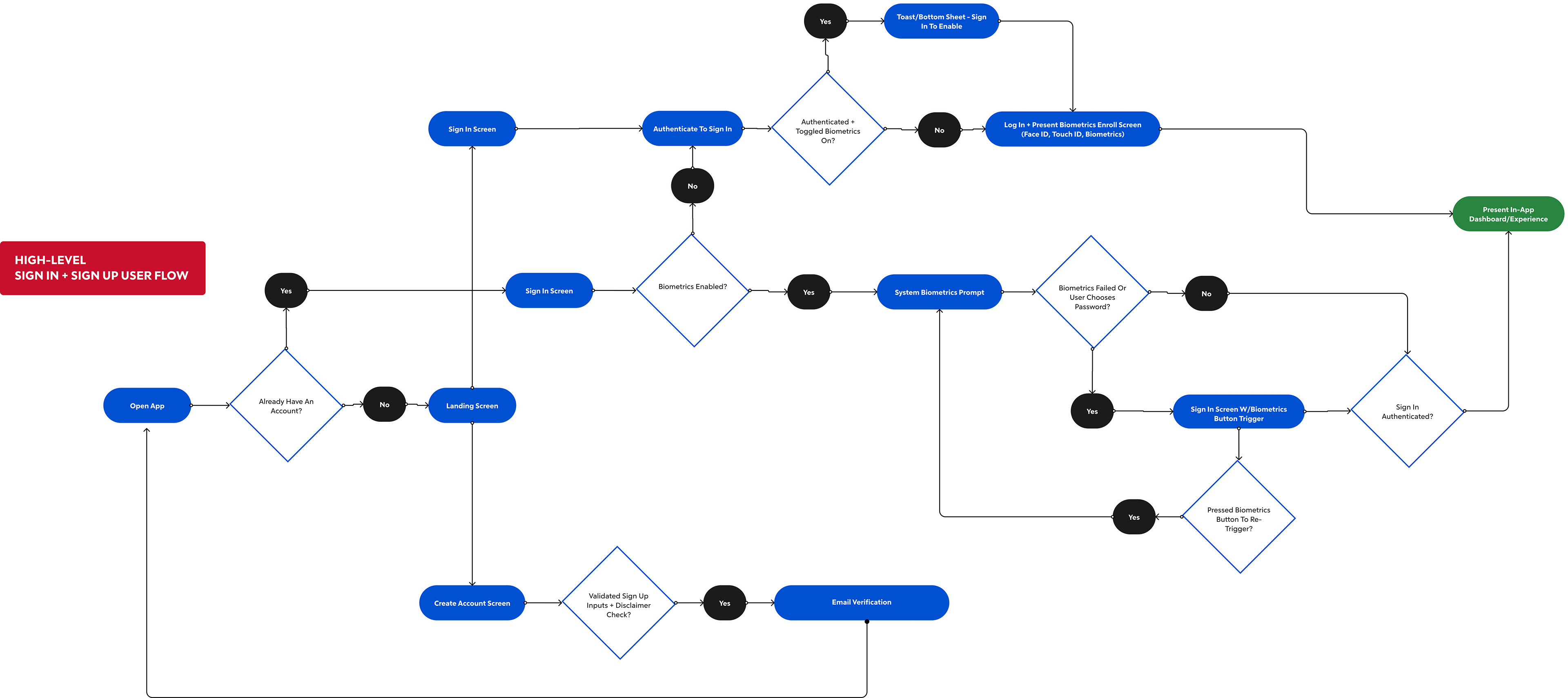
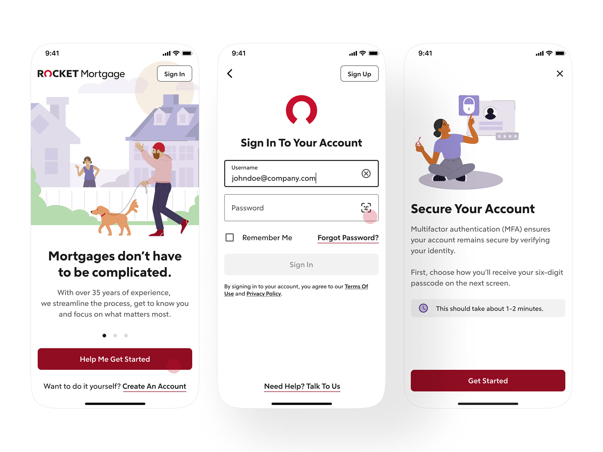
User flow for the initial MVP solution.

Initial Solution:
We worked with our policy teams, web teams, and technical architects to create a solution that would allow clients to continue their login process, for both web and native mobile, without re-creating our current login experience.
Due to timeframe (had under a month) we settled on an MVP that would utilize a slightly modified web flow -vs- create our own solution. We simply reskinned with no ability to include a dark mode variant, simplified the flow, and published within a bottom sheet to satisfy the requirement.
Due to timeframe (had under a month) we settled on an MVP that would utilize a slightly modified web flow -vs- create our own solution. We simply reskinned with no ability to include a dark mode variant, simplified the flow, and published within a bottom sheet to satisfy the requirement.
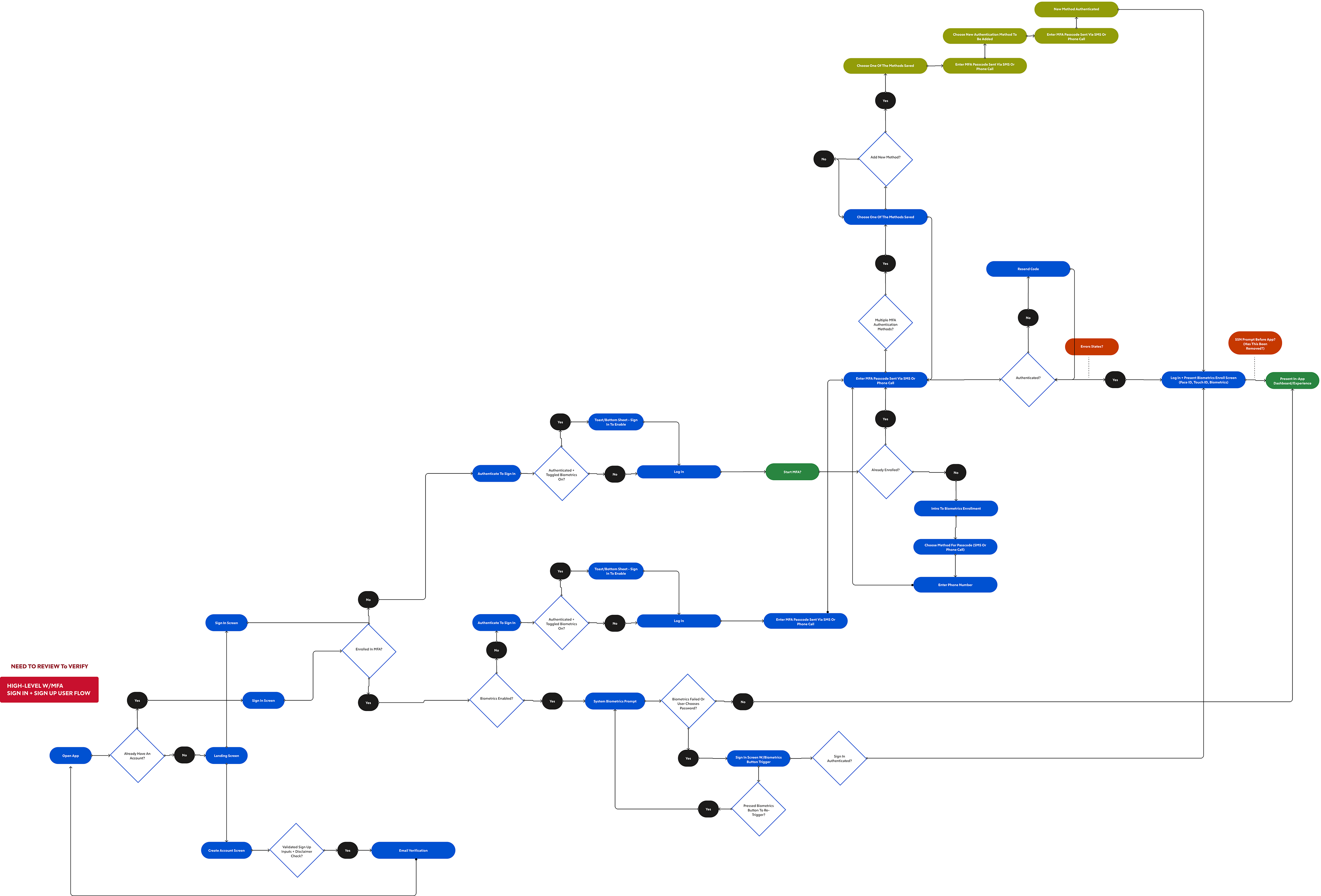
Revised user flow to include added mobile native experience and additional paths.

REVISED AFTER RELEASE:
Even though this solution met the requirement of the MFA mandate, clients felt disjointed and complained about the experience. The UI seemed clunky and not consistent with the mobile app, the flow wasn’t smooth and made users feel as if they were in a different app. Users also complained about not understanding the need and the steps involved.
Gathering the user feedback, I went back to the tech architects and Product Manager to create a more custom UI and flow for the mobile native app. After confirming with the tech architect that it was possible for a custom solution, we got the Product Manager and engineers on board. User testing was done to ensure we were improving and meeting the expectations of our users. We added a progress bar for steps, better intro to explain the process with an expected timeframe note, more info to encourage biometric enrollment, and a refreshed the welcome screen visual with a dark mode variant.
Gathering the user feedback, I went back to the tech architects and Product Manager to create a more custom UI and flow for the mobile native app. After confirming with the tech architect that it was possible for a custom solution, we got the Product Manager and engineers on board. User testing was done to ensure we were improving and meeting the expectations of our users. We added a progress bar for steps, better intro to explain the process with an expected timeframe note, more info to encourage biometric enrollment, and a refreshed the welcome screen visual with a dark mode variant.
HOW WAS THIS SUCCESSFUL?
98% - Of users who we tested had no problems completing the MFA enrollment flow without intervention (up for 75%).
95% - Biometric enrollment for all registered—exceeding business expectations.
Overwhelmingly positive sentiment in relation to the improved UI and user flow
User felt the content communication was clear and liked the additional UI elements (progress flow)
User felt the content communication was clear and liked the additional UI elements (progress flow)

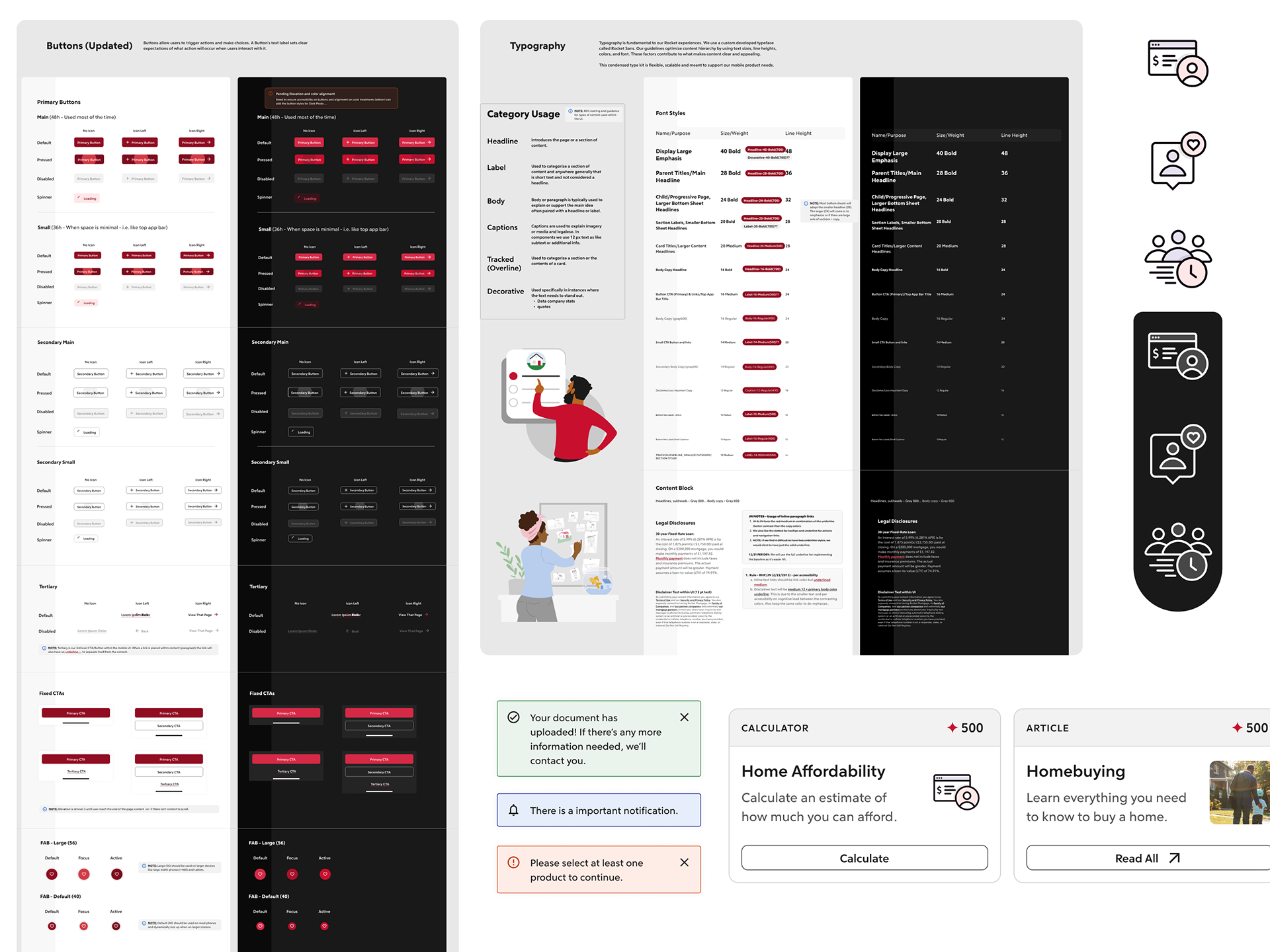
🚀 ROCKET DESIGN SYSTEM

OVERVIEW:
Rocket Design was at a point were the previous UI components were outdated, lacked a modern feel, and wasn’t responsive nor adaptive to mobile UIs. I came on solely leading our mobile mortgage platform were this same UI didn’t have a mobile or dark component to it. In 3.5 - 4 weeks, I was able to create a mobile native design system (iOS and Android platforms) that was shareable across our internal and external vendors to give us a good starting point on the future of rocket design.
—
👋 MY ROLE: Principal UX Designer
WHO I WORKED WITH: Design System Team, Design Director, Engineers, UI/UX Designers
PROJECT DURATION: 2-4 weeks (initial phase), 8+ months (full redesign)
TOOLS: Pen + Paper, Adobe XD, Figma, Mural, Airtable
Initial Solution:
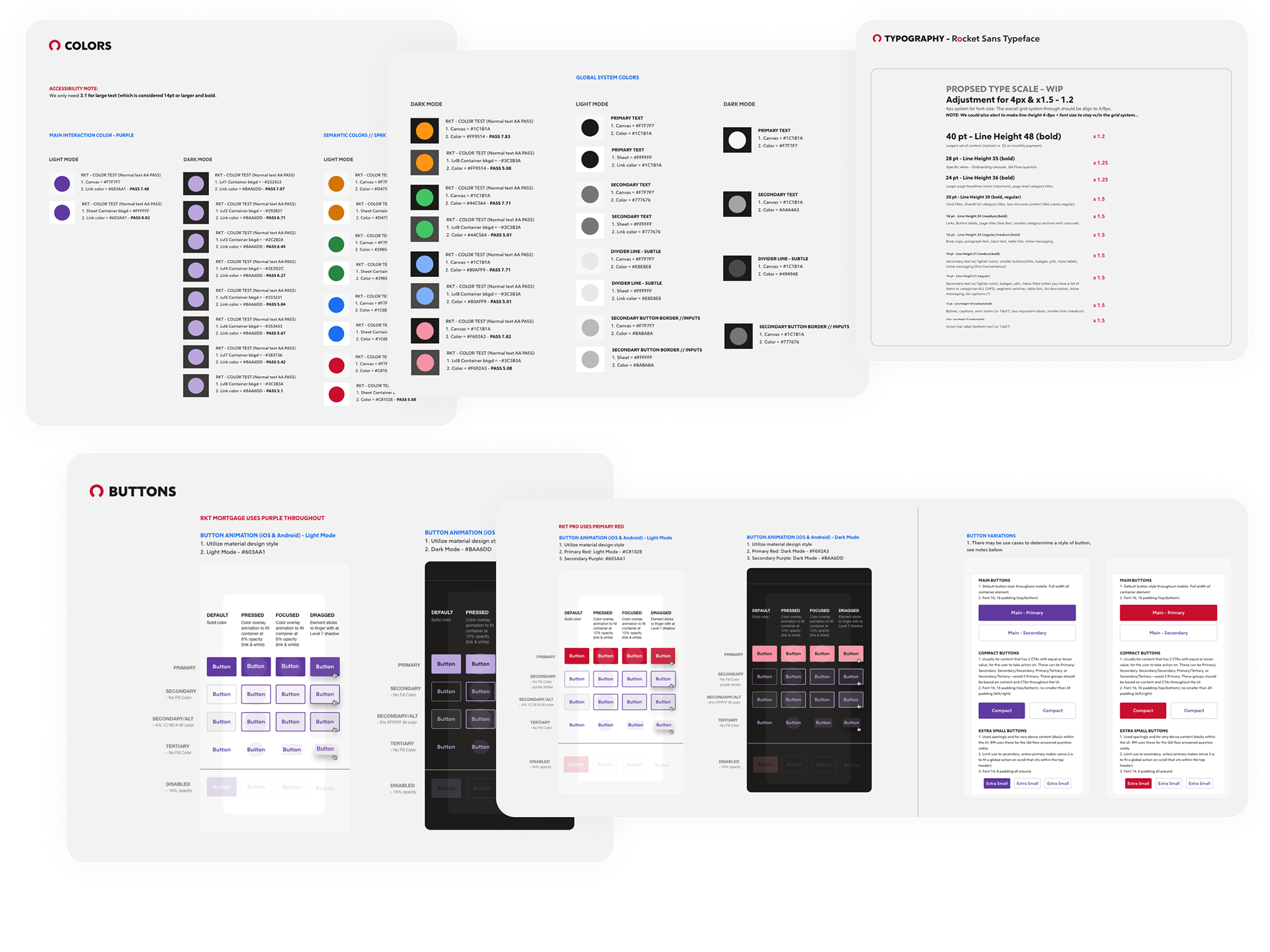
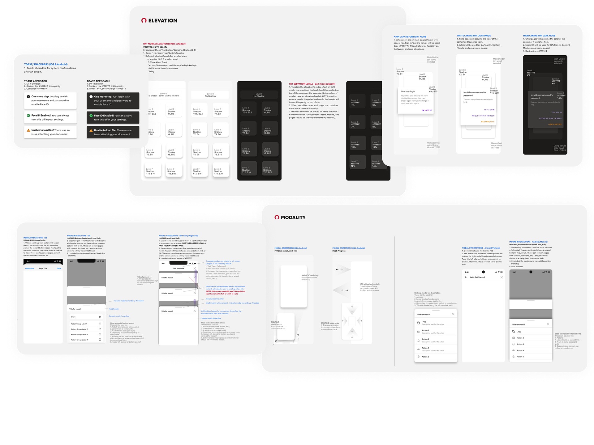
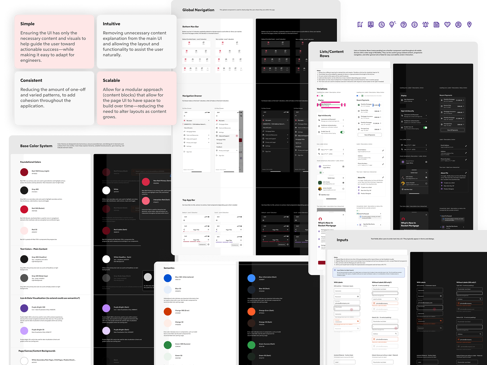
Because this wasn’t a complete company overhaul, I had to ensure it fit well within our web framework and not create a disjointed experience between the two. Utilizing Adobe XD (our current platform at the time) I created a simple UI design framework that encompassed our core components (buttons, iconography, colors, fonts scaling, form fields, notification styles, card elevation, dark mode variant, and common patterns)—taking inspiration from Material 2, Salesforce Lightning, Atlassian, and IBM Carbon. This initial iteration was well-received through testing, usage, while supplying our vendors a design system to build from on any outsourced features/products. It went so well, that the larger design system team used my work as the leading baseline for the full corporate redesign.
REVISED AFTER RELEASE:
With the various platforms of web and mobile, and the growing need of a more robust system that could be utilized by more than just the mortgage product as we transitioned to Figma, we needed to re-think and create a more scalable corporate-wide design system. From the success of this initial design system, the Rocket Design System team, chose to use my work as a baseline and adapt it to the Material Design System (for easier scalability and faster production). I was able to help contribute to the growing system of 41 components, 532 component variants, 10 patterns, and 52 pattern variants. We also removed our orbital purple color as it didn’t suite our brand and move toward a more red and black color scheme. The new corporate design system was dubbed "Rocket Design System" in which I led the mobile style and implementation for the Rocket Mortgage mobile product.
HOW WAS THIS SUCCESSFUL?
100% - Positive adoption rate across mobile products.
100s - Of hours saved on manual code overrides for development teams.
Easier scalability and cleaner code (reducing bloat) across both iOS and Android.
Stronger collaboration between engineering and design teams
Stronger collaboration between engineering and design teams

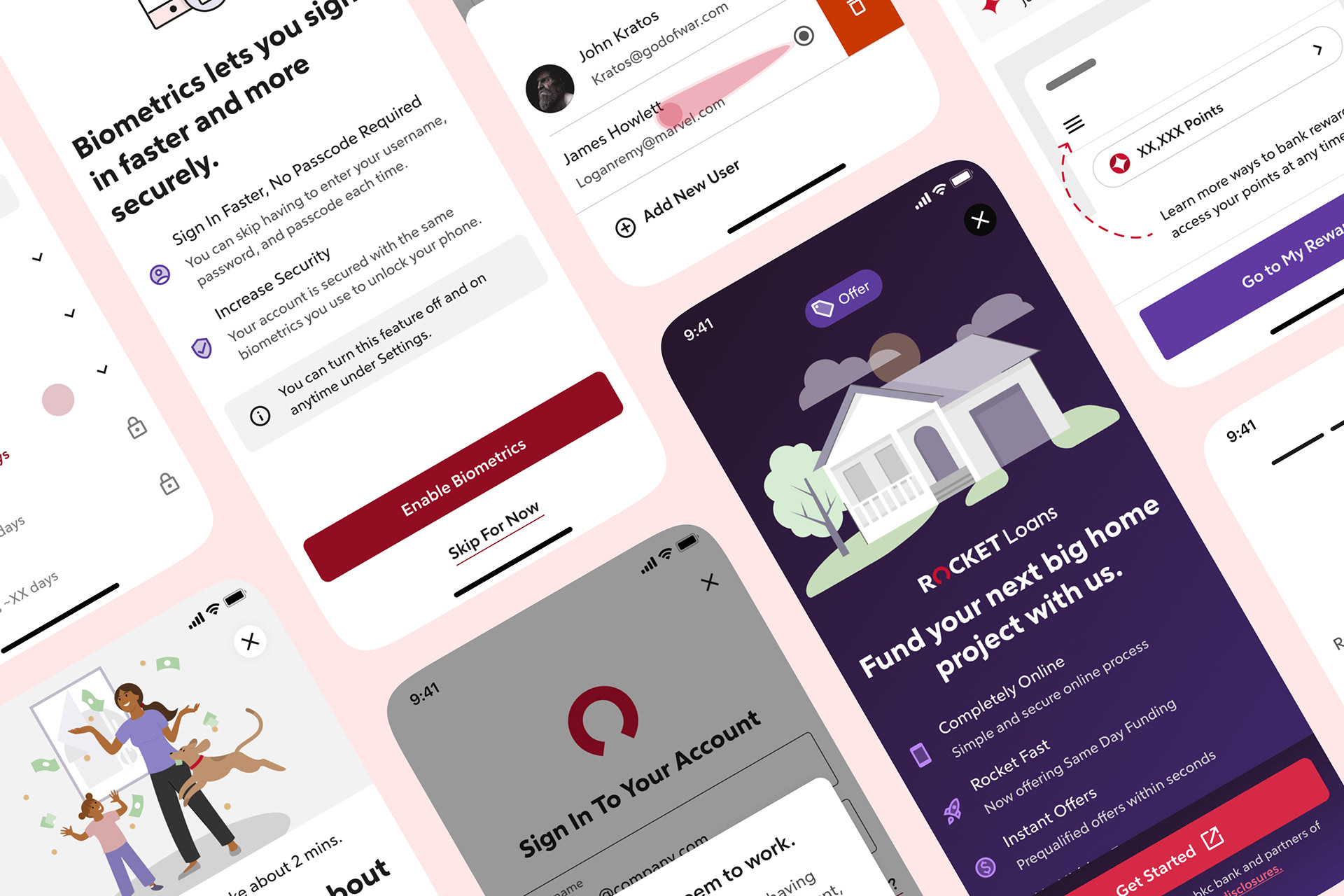
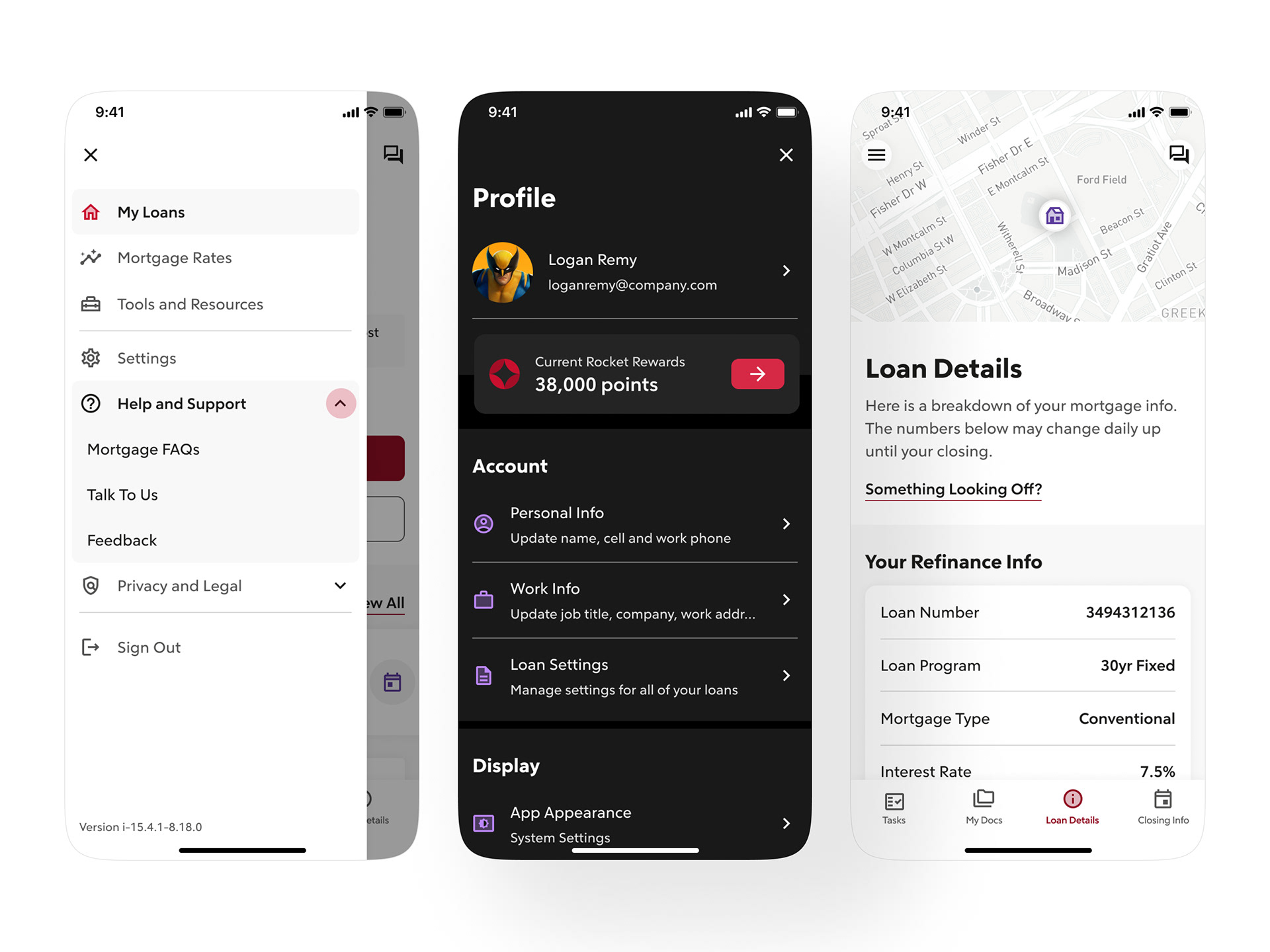
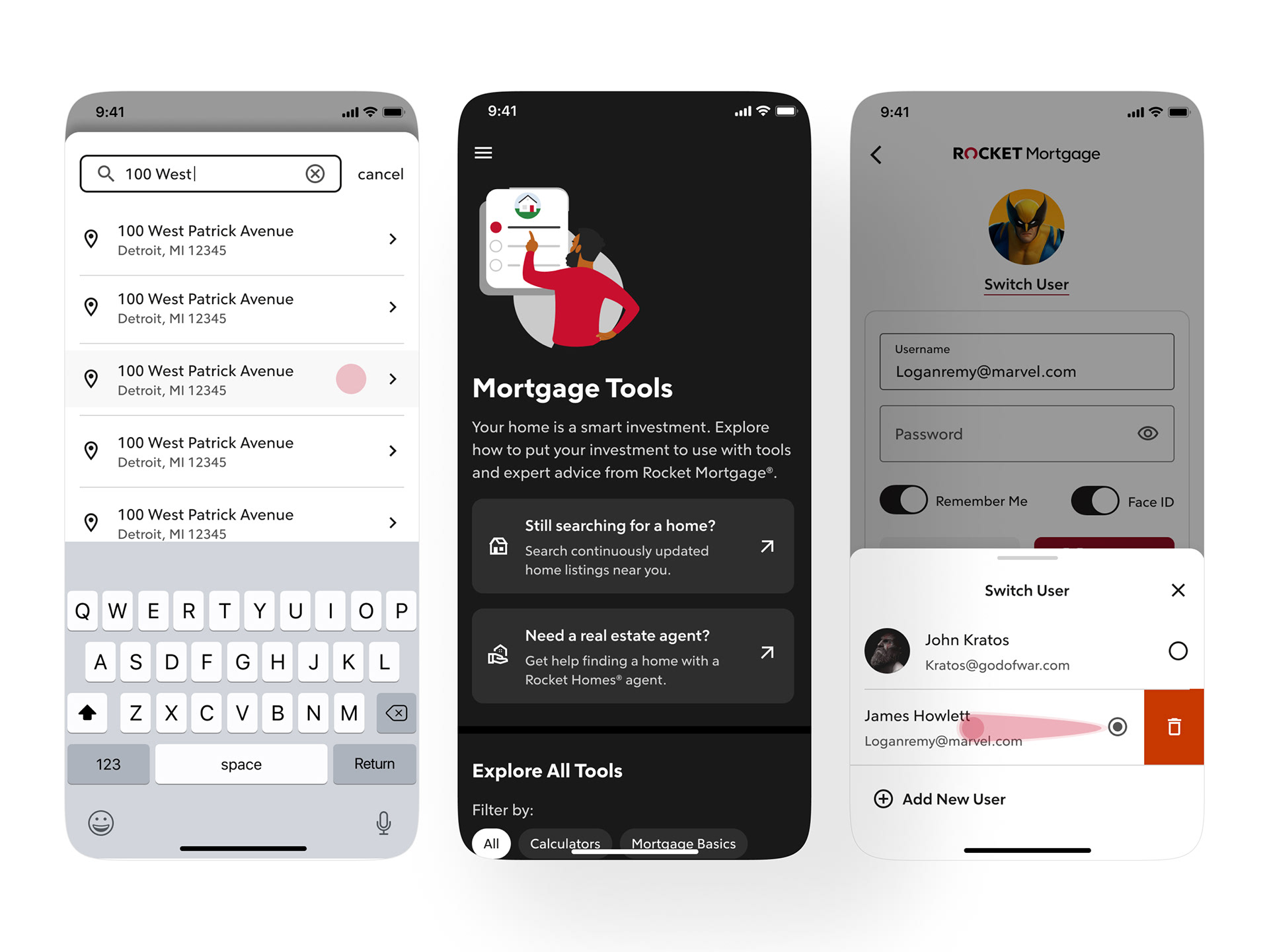
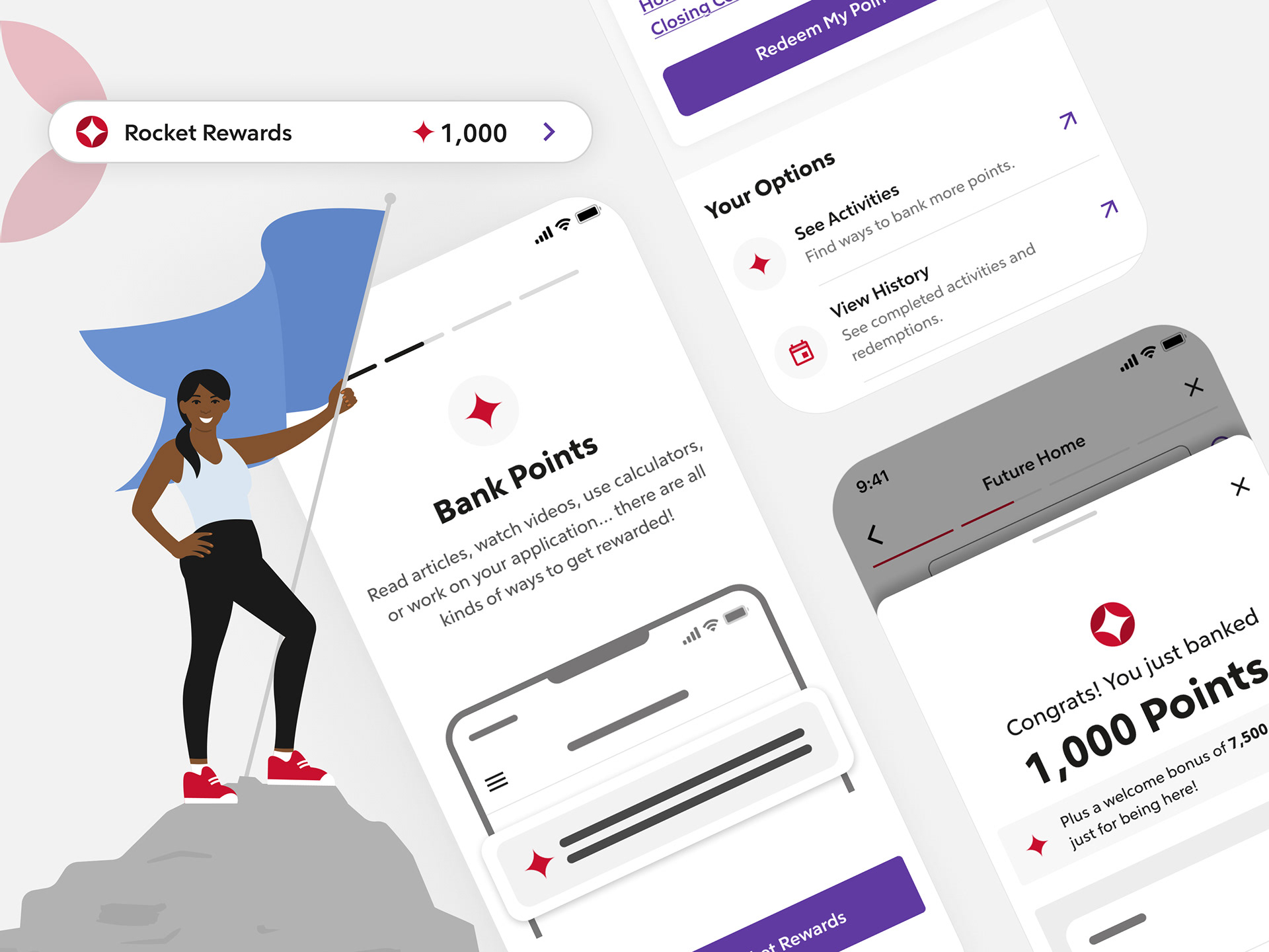
🏡 ROCKET REWARDS
OVERVIEW:
There was a massive downturn in 2022, within the US mortgage market. The amount of loan volume was declining and first-time homebuyers wasn’t sure purchasing a home was right for them. Rocket Mortgage was looking for a way to help out and decided to create a loyalty program that leveraged gamification to build connections with home seekers aiming to purchase within 6-24 month window and current servicing clients.
_
👋 MY ROLE: Principal UX Designer
WHO I WORKED WITH: Product Owners, Copywriters, Engineers, Web Design Team
PROJECT DURATION: 4-6 months (initial release)
TOOLS: Pen + Paper, Figma, Mural, Airtable, MS Word
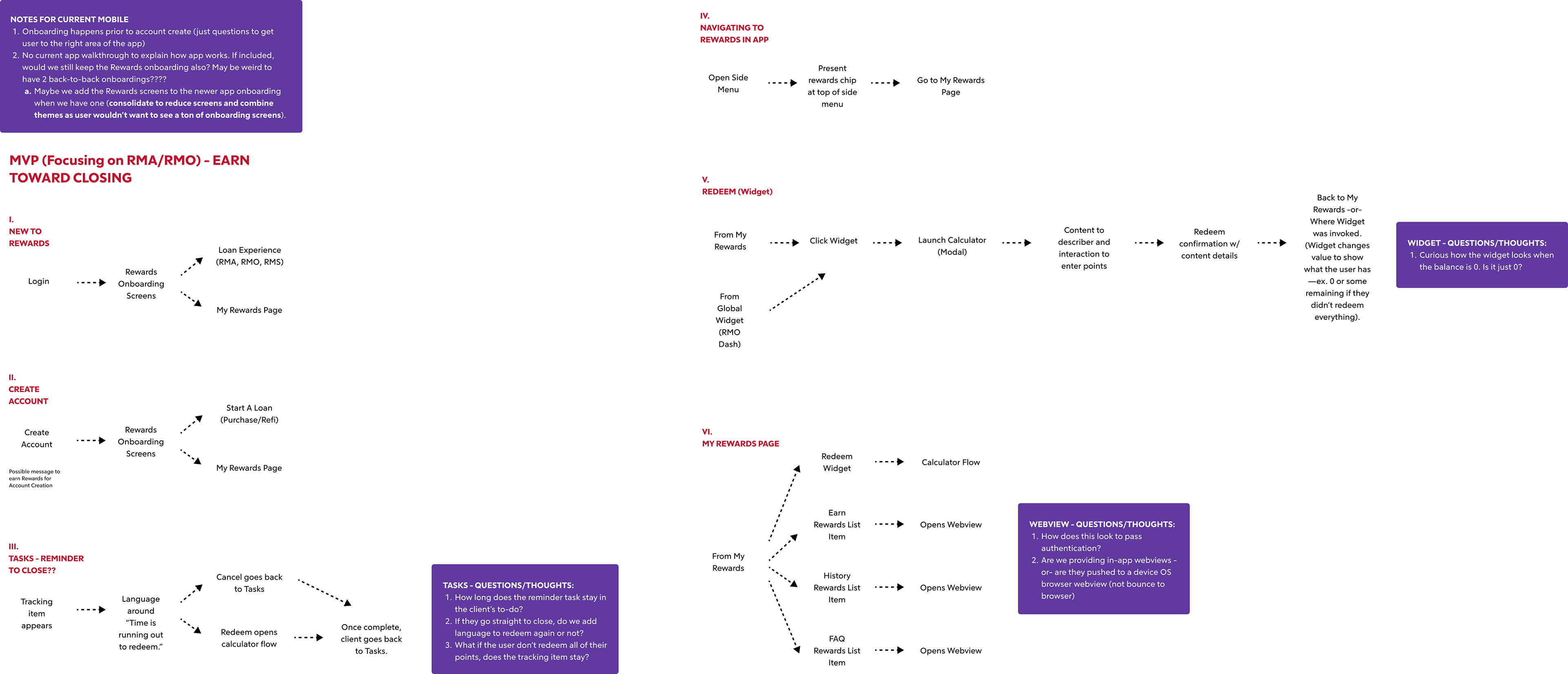
Additional native user scenario flows for the mortgage application & origination experiences.
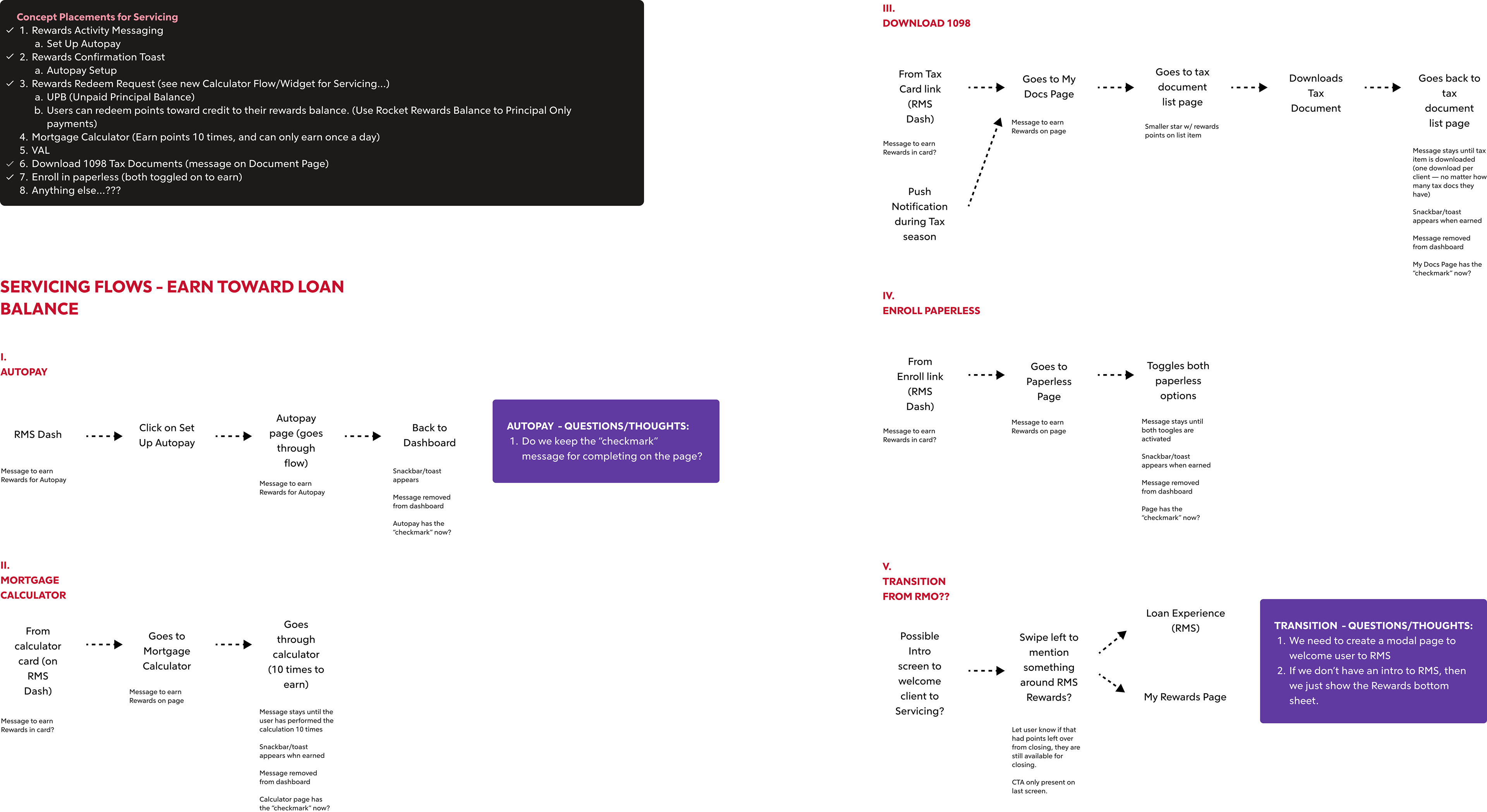
Additional native user scenario flows for the mortgage servicing experience.
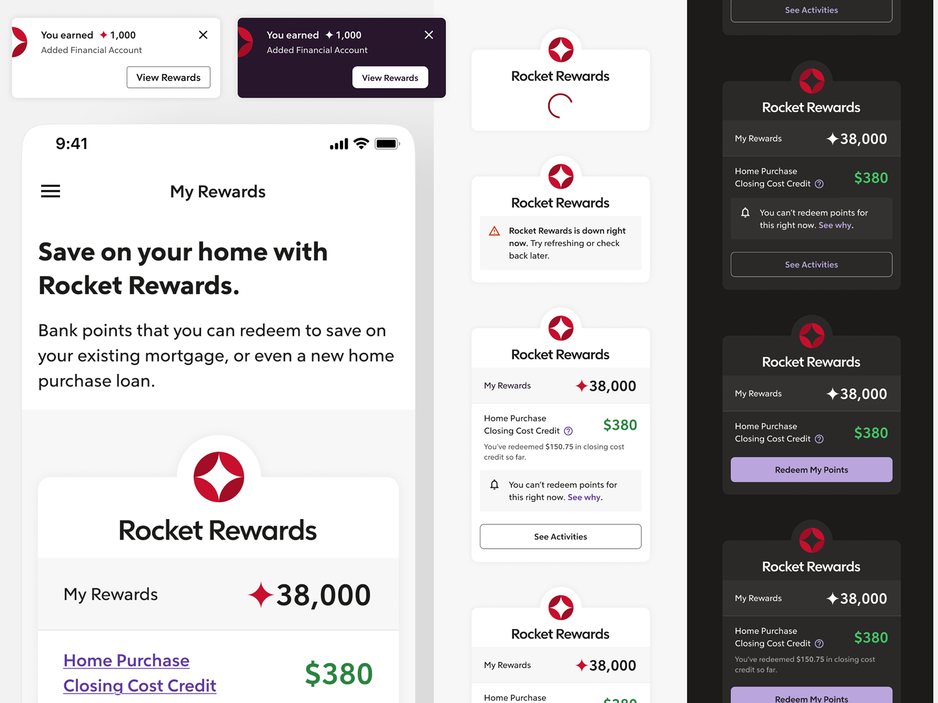
Rewards widget design, notification template, and my rewards page
Initial Solution:
Being in mobile, we wanted to ensure alignment with the current web team while giving our insights, user scope, and ensuring we could translate the main elements into a mobile MVP. To tailor the experience to mobile, I had to account for different user scenarios unique to the native app that allowed new users to earn and redeem their points. With only a month or so, we were able to provide the key solutions of providing a placement for the rewards product within the app (dedicated page), content to introduce the plan and it’s value to the users, real-time notification feedback when an reward was earned, info placement in key areas of the mobile app to show where and what the reward would be for certain tasks performed, a module with direct links to see the full program and ways to redeem points. A key element was the rewards widget (placed to allow users to redeem from anywhere) that needed to be modified for both a light mode and dark mode treatment, which led to a visual overhaul that resonated better with our mobile users and leadership team.

Onboarding screens to introduce rewards program.
REVISED AFTER RELEASE:
After we learned that users wanted the ability to redeem within the app, clearer info about the program, and a history view of past redemptions. While working with technology to understand limitations, we were able to revamp the UI and UX, while modifying time scope to accommodate the new technologies needed for the additional user flows. The mobile app included a real-time calculator to see redemption options, an intro onboarding for first-time users, a way to track history on redemptions, cleaned up UI to push users to the dedicated rewards page, and enhancements to the actual Rewards page found more prevalent in the global sidebar.
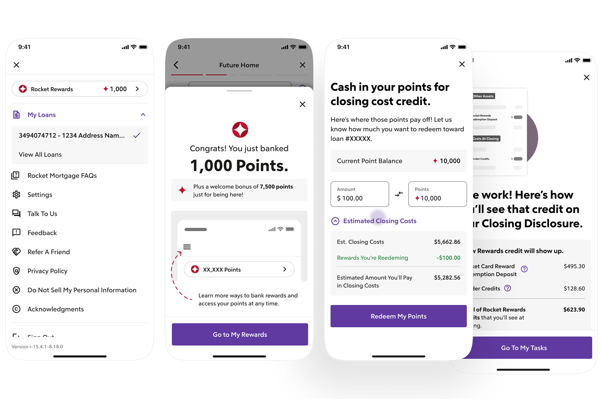
Side nav integration, first-time earn bottom sheet, redemption calculator and closing breakdown.
HOW WAS THIS SUCCESSFUL?
1M+ - rewards program users.
- of redeemed rewards towards closing as of Feb '23 (4 months post launch).
98% - Comprehension of the program from users.

— MORE PROJECTS COMING SOON —