User Interface and Experience Flows
Overview  |  Welcome  |  Account Create  |  Onboarding  |  Feed/Store  |  Checkout  |  Chatbot
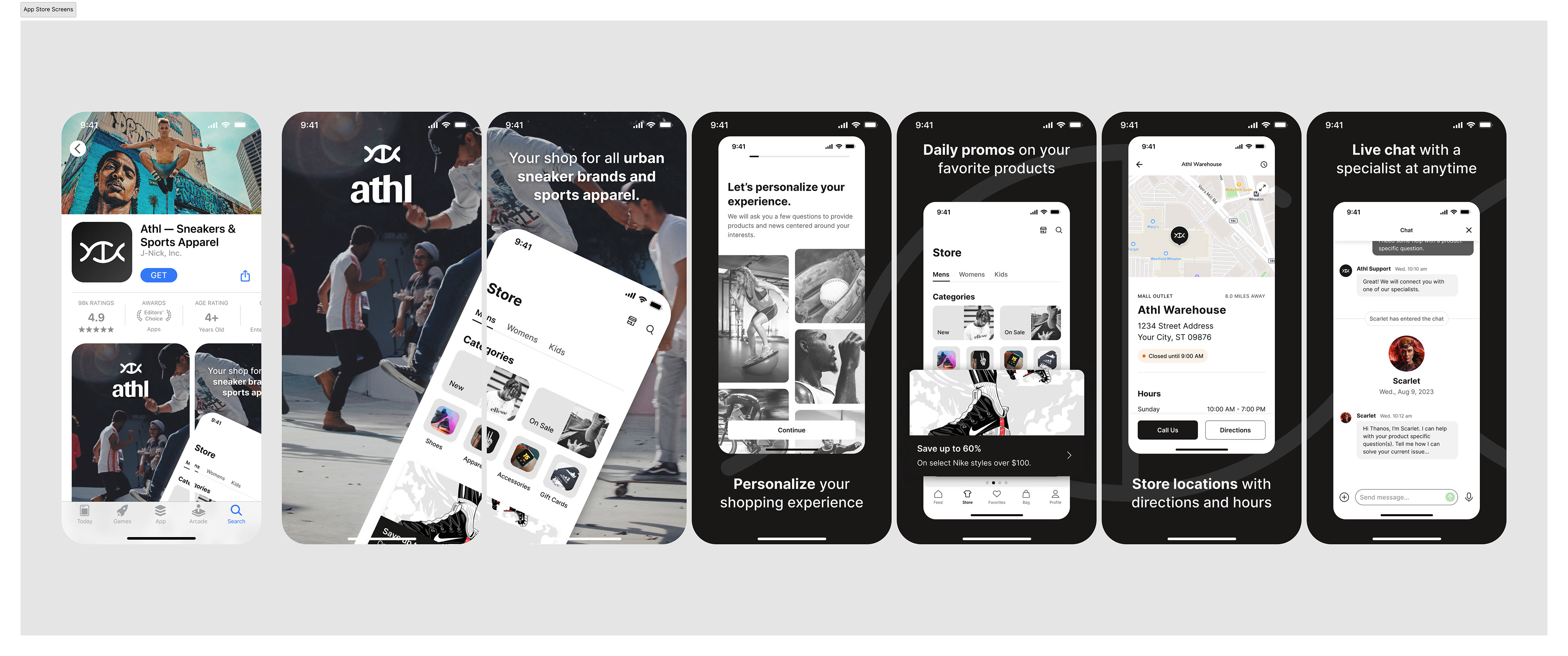
APP OVERVIEW
We are a global lifestyle reseller providing exclusive licensed products from your favorite apparel and sneaker retailers. Our curated process is geared around unique and popular products, while keeping the athlete and urban lifestyle at the top of our mind. Our deep history in the urban culture, gives us the upper hand and ears to what our athletes need to stay fresh and organic.

App Store Screens

DETAILS - What To Expect?
​​​​​​​'Athl' (taken from the word "athlete" ) is your one-stop destination for the ultimate urban sneaker and sports apparel experience. Elevate your street style with the latest collections, exclusive drops, and a vibrant feed of upcoming and history driven content. 'Athl' not only simplifies your shopping journey with seamless navigation and all of the top brands, but also connects you to diverse stories on the urban culture and key players involved. Step into a world where innovation meets urban culture, and let 'StreetStride' redefine your urban sneaker and sports apparel shopping adventure – where every stride tells a story of style, passion, and authenticity.
This portfolio project showcases my conceptualization of the app.

Welcome video


👤 ATHL PROTO PERSONA
Not every project requires a persona, but wanted to ground the concept on a user archetype to create for.
With the goal already defined (to create a one-stop athletic urban apparel app, allowing the user to purchase products, customize their interests, have in-app help, and a related blog style feed) we took additional insight from both what we wanted to do and what our competitive landscape was—while still defining characteristics of our ideal user.

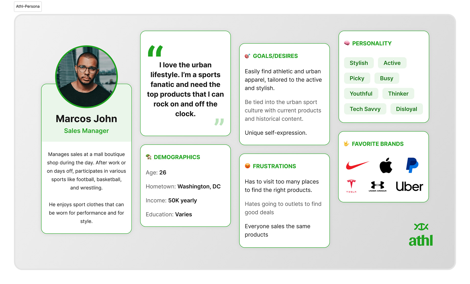
Athl Concept Proto-Persona


🖌 CONCEPT SKETCHING/IDEATION
Having a plethora of sport apparel apps to reference (Nike, Under Armour, Footlocker, to name a few), we began to analyze some of the most ideal features that would translate well into our concept. We looked at user flows, checkout experiences, app reviews, etc. to get an idea of what the app landscape looked like and what current users liked/disliked.
For the MVP, we outlined the main features of the app concept and chose to move forward with Login, Account Create, Onboarding, Checkout, Profile, Search, and Help/Chatbot.
Each feature gets broken down to it's core page requirements to ensure all elements within the UI is created for interaction and layout.

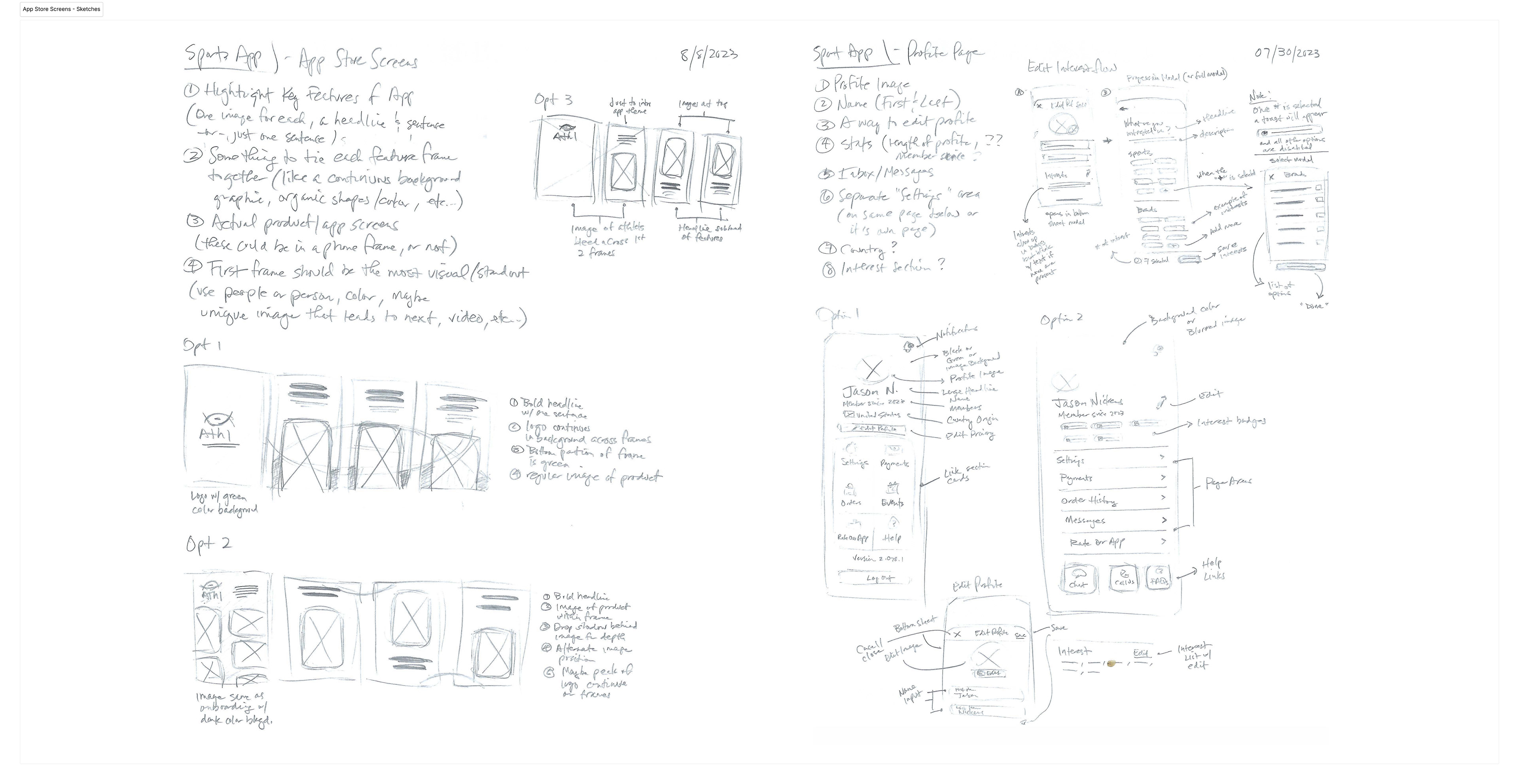
App Store & Profile Page Feature Outline + Sketches


🖌 UI ELEMENTS
For Athl we wanted to communicate a clean ui aesthetic to allow the content to be easily digestible and maximize focus on the content. Using neutral colors like grays with the primary action of green, emphasizes the organic nature that the core of an athlete is within it's DNA (check the logo).
We chose a strong typeface in Inter whose characters embody a strong structure, flexibility within it's various styles and clear legibility.
The main colors of the app are grays with various tints and shades to help the accent and semantic elements standout within the UI.
Imagery was carefully chosen to help communicate the lifestyle element of the apparel, while using dynamic illustration to help create a little style within the pages when needed.

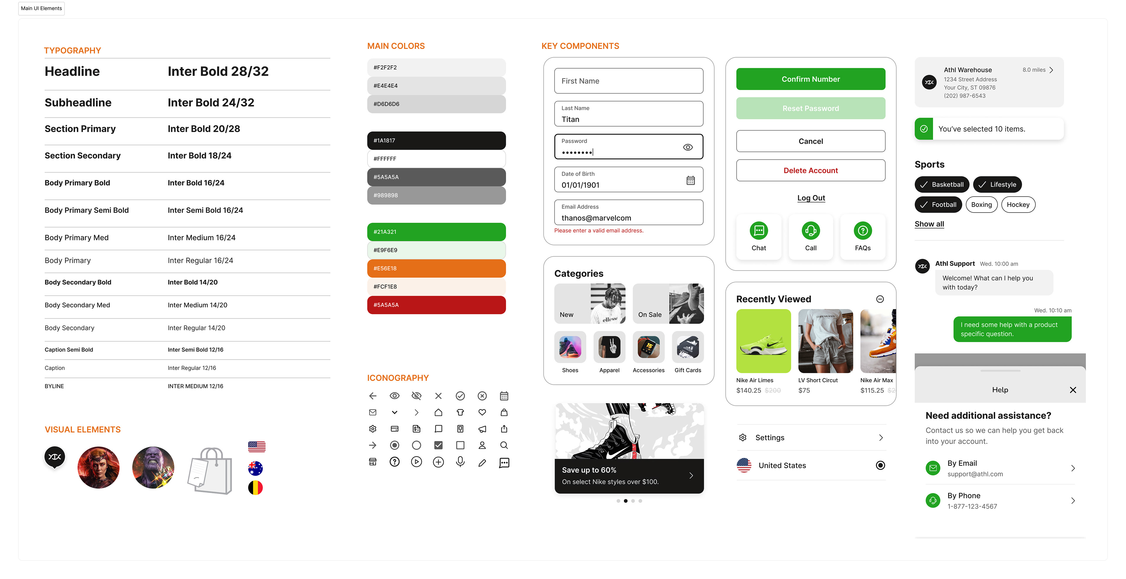
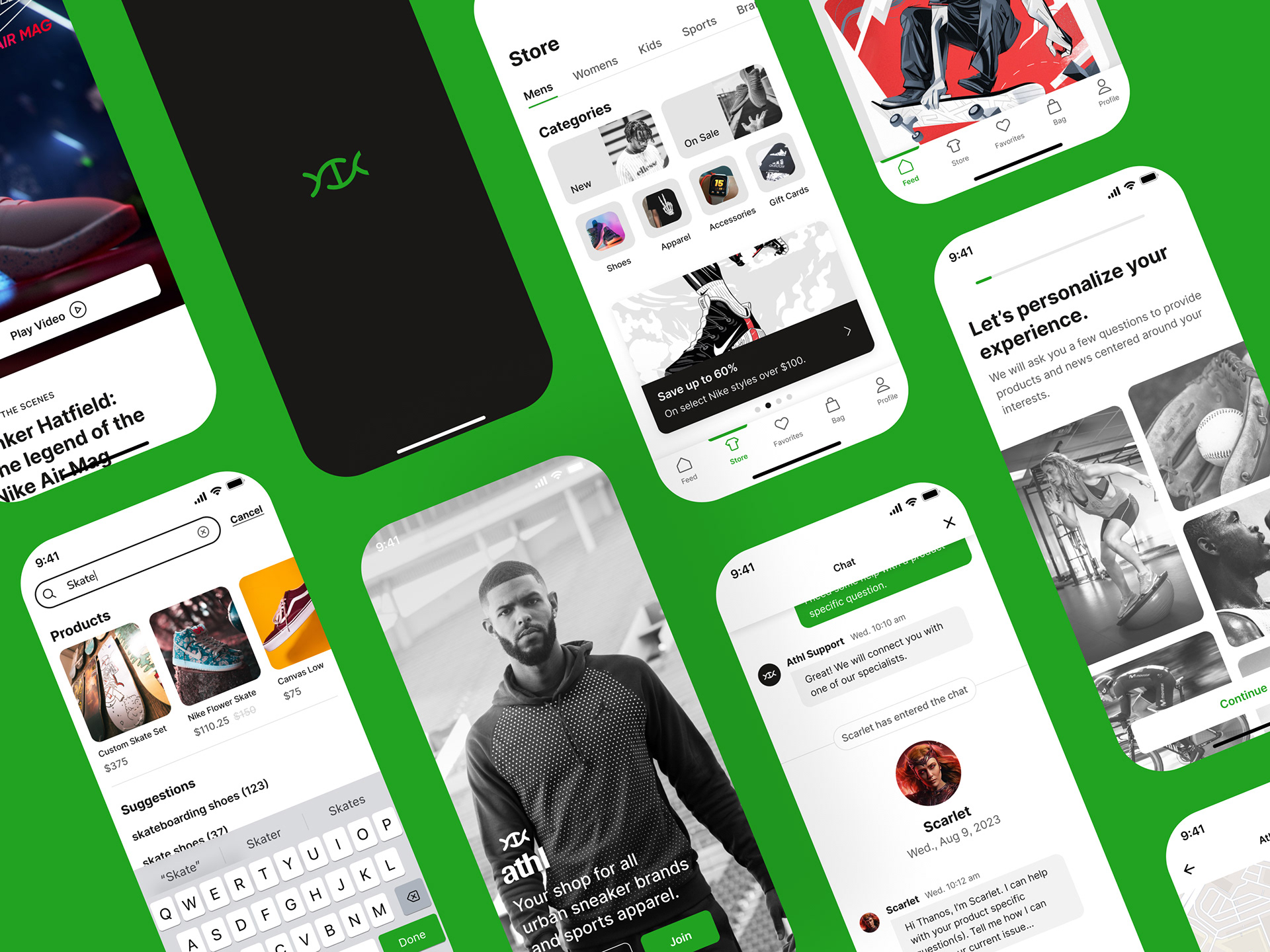
Key elements used throughout the app


👋 WELCOME + LOGIN
The app starts the user off with images of diverse athletes displaying the physical toughness of various chosen sports. Then travels into a clean login with a seamless integrated in-app reset password experience.

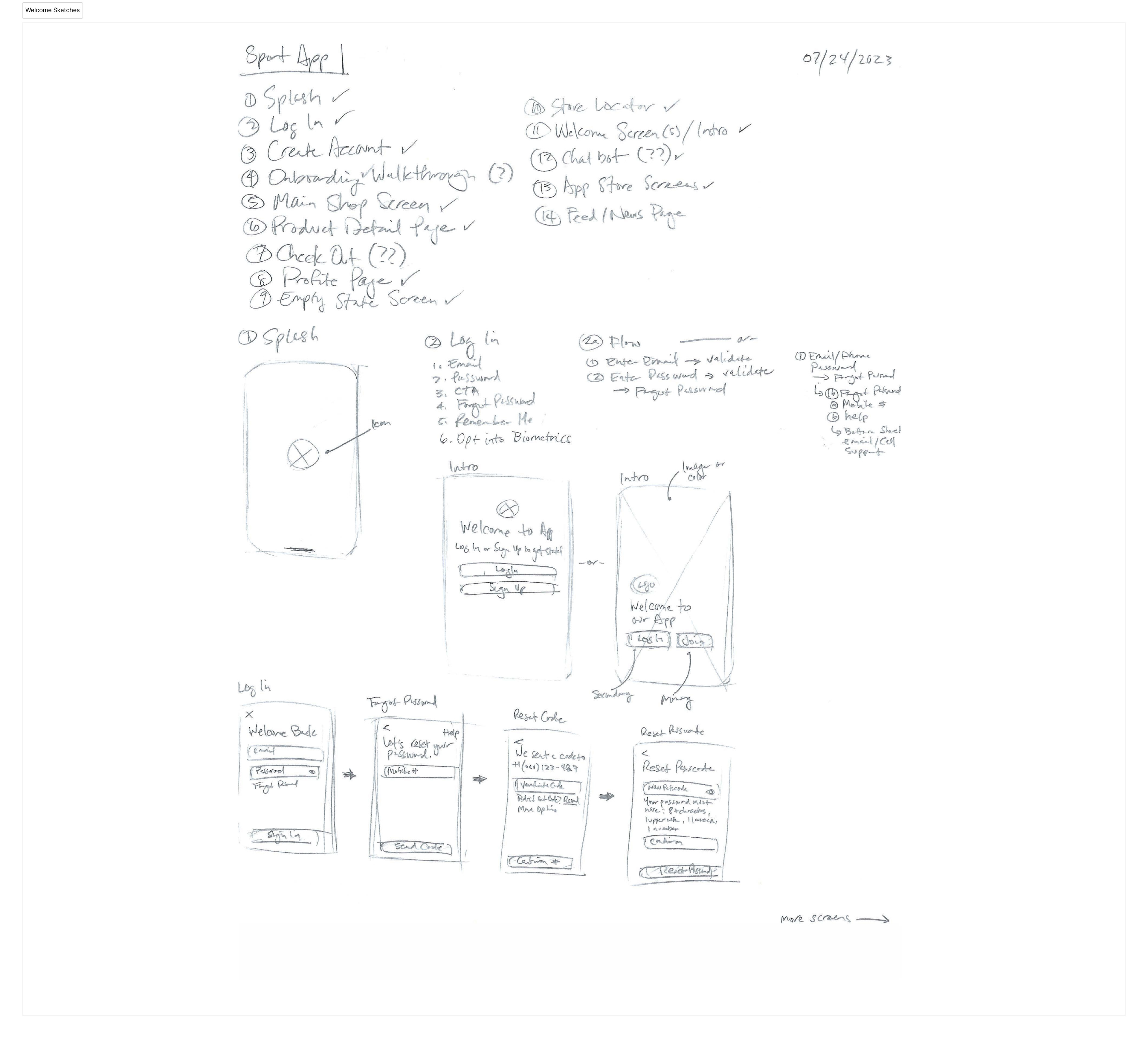
Welcome & Login Feature Outline + Sketches

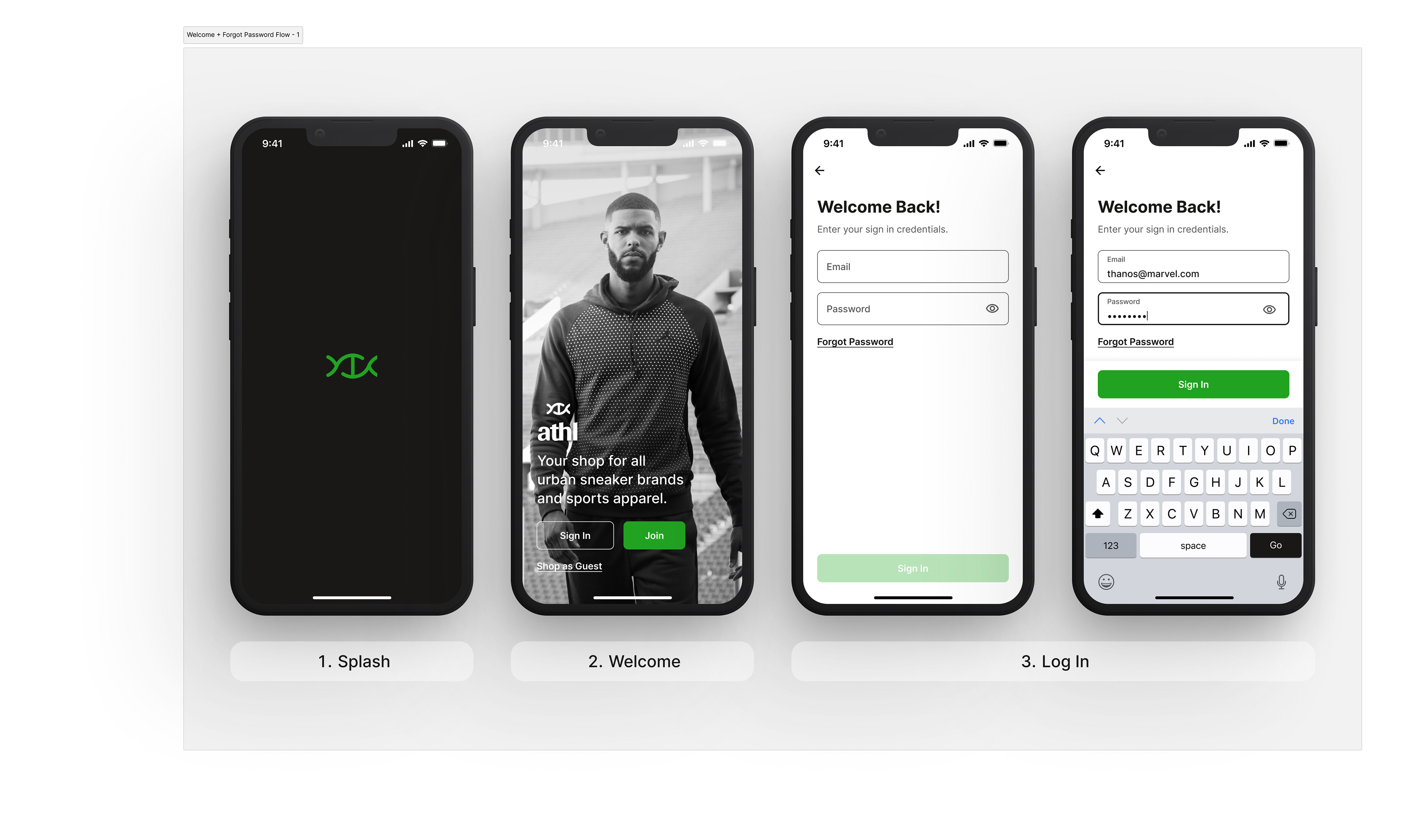
Welcome -to - Login Key Screens

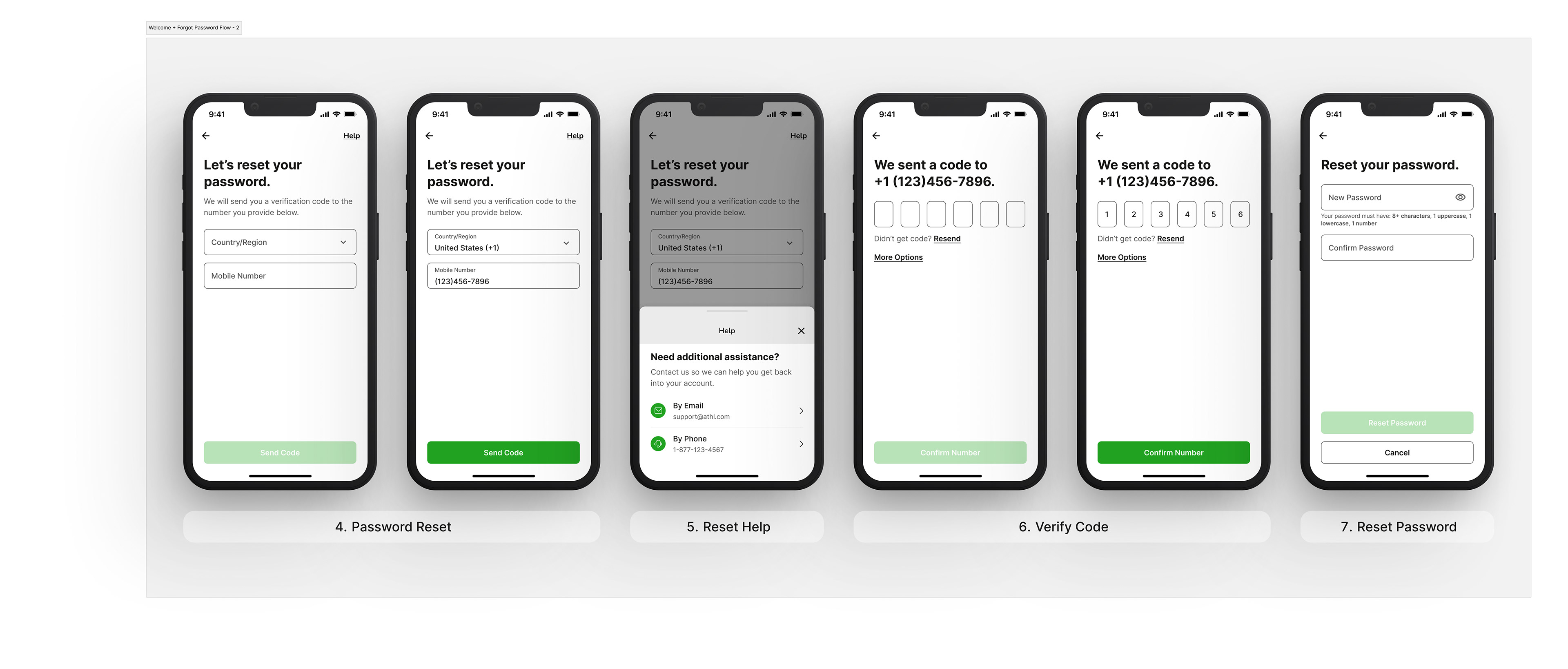
Password Reset Key Screens


🪪 ACCOUNT CREATE
A friendly introduction to help easily guide users into creating their account. Each screen has copy to reinforce the why behind the content we are requesting. The progress bar allows the user to have a fundamental idea on the length of the process.

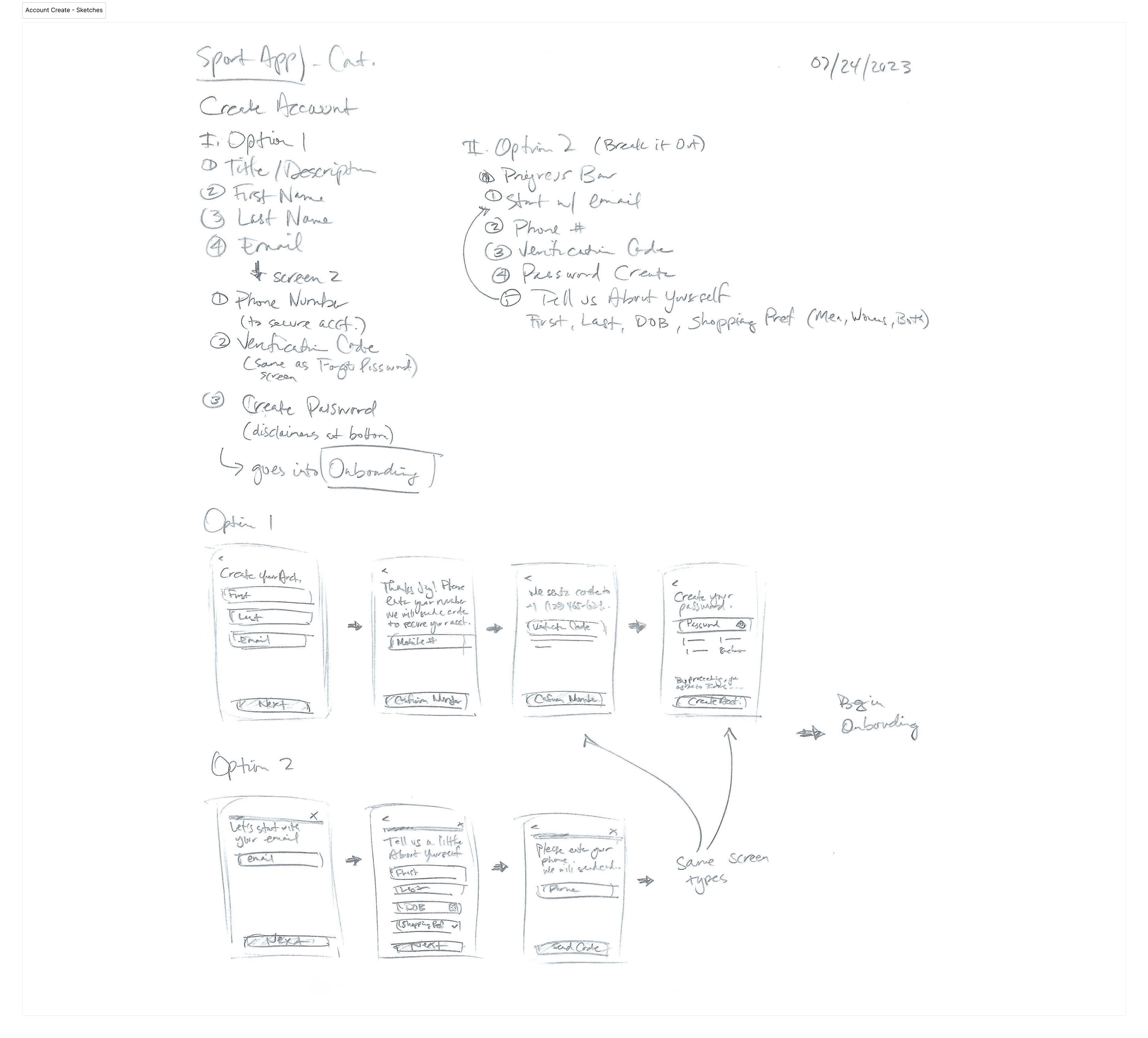
Account Create Feature Outline + Sketches

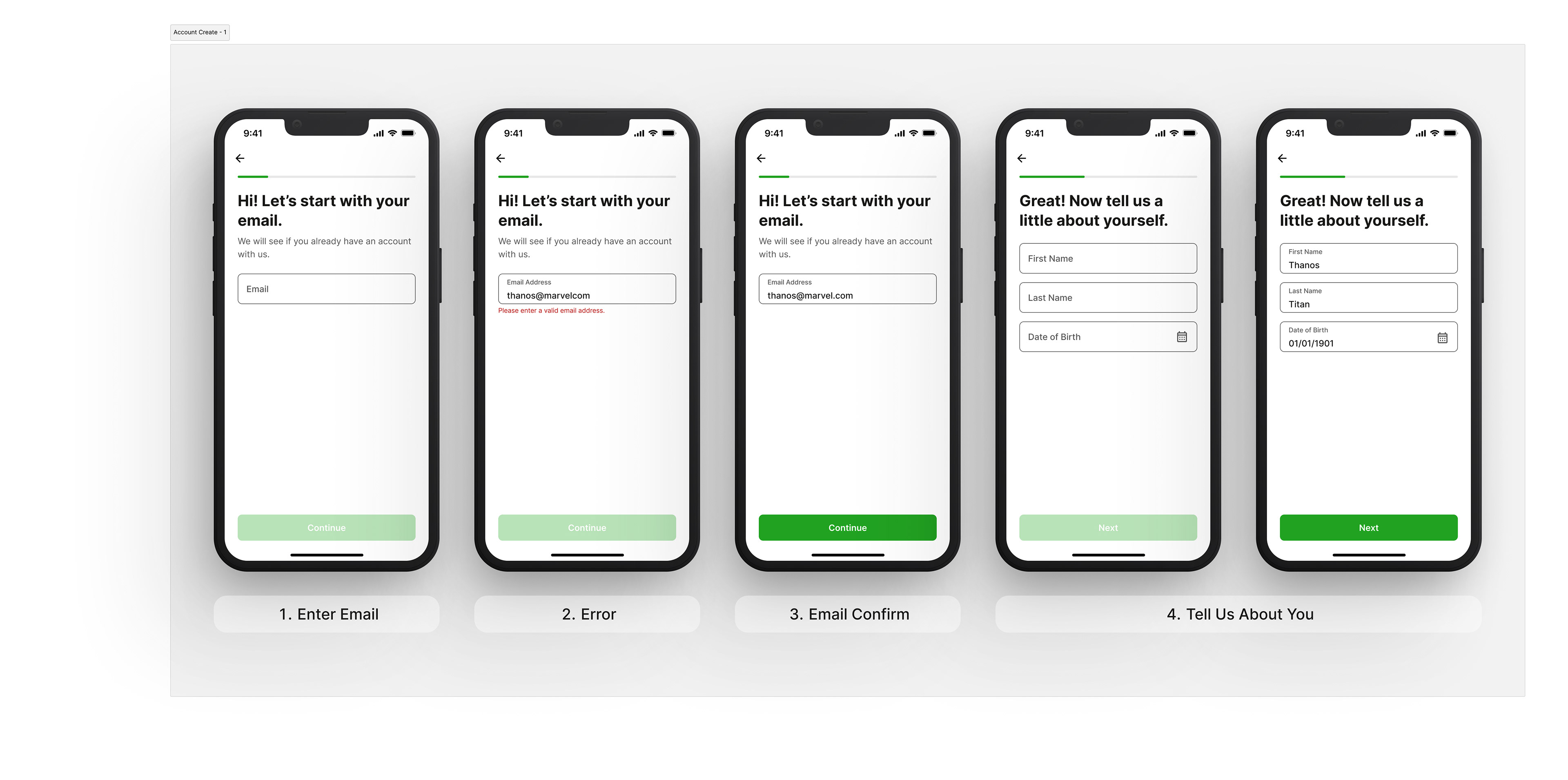
Account Create Flow Key Screens 1-4

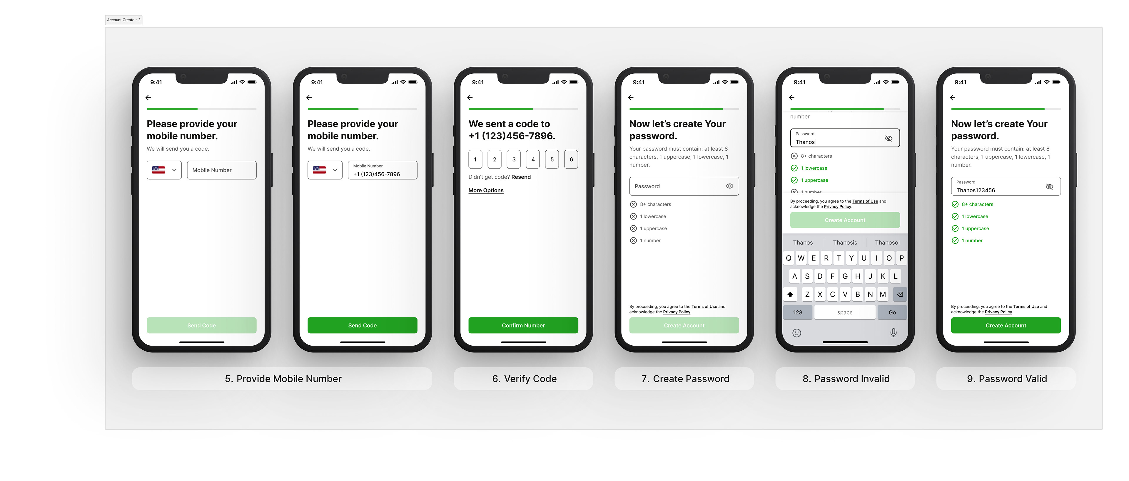
Account Create Flow Key Screens 5-9


🗺 ONBOARDING
From account creation, we take the user through our onboarding process. Here we ask the main questions to ensure we provide a tailored experience for them. We want to know where they are from (defaulting to the country based on the country code of the number they provided during account create), their shopping preference, shoe size, and interests.
However, users can always travel anywhere across the app, and even change their preferences within their profile view.

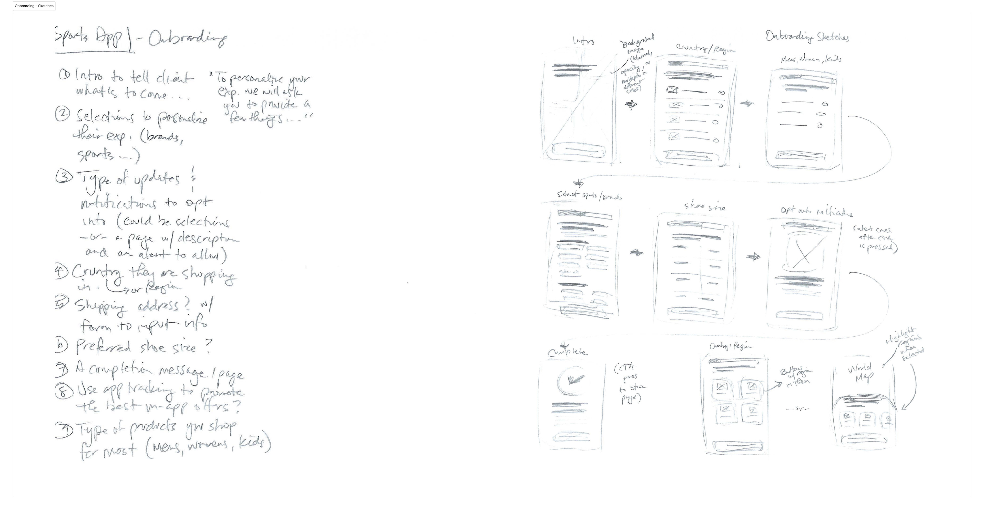
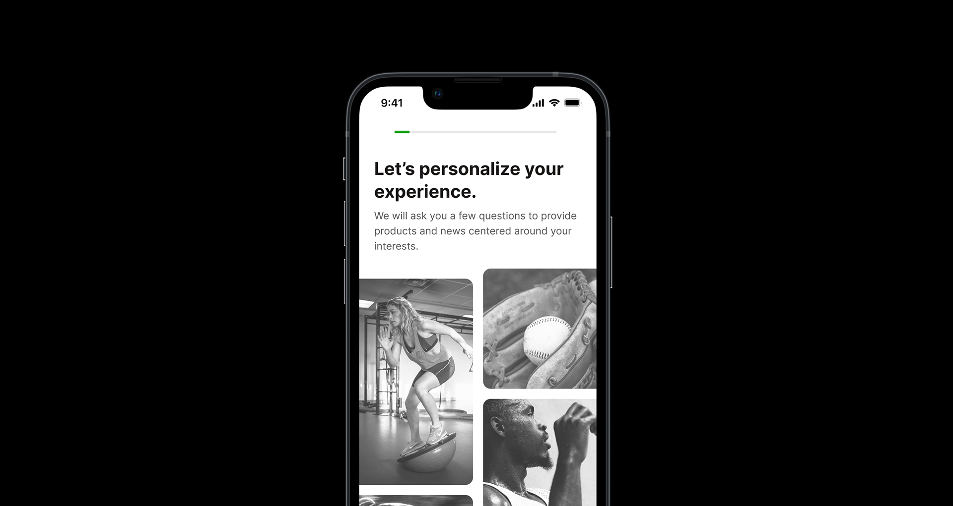
Onboarding Feature Outline + Sketches

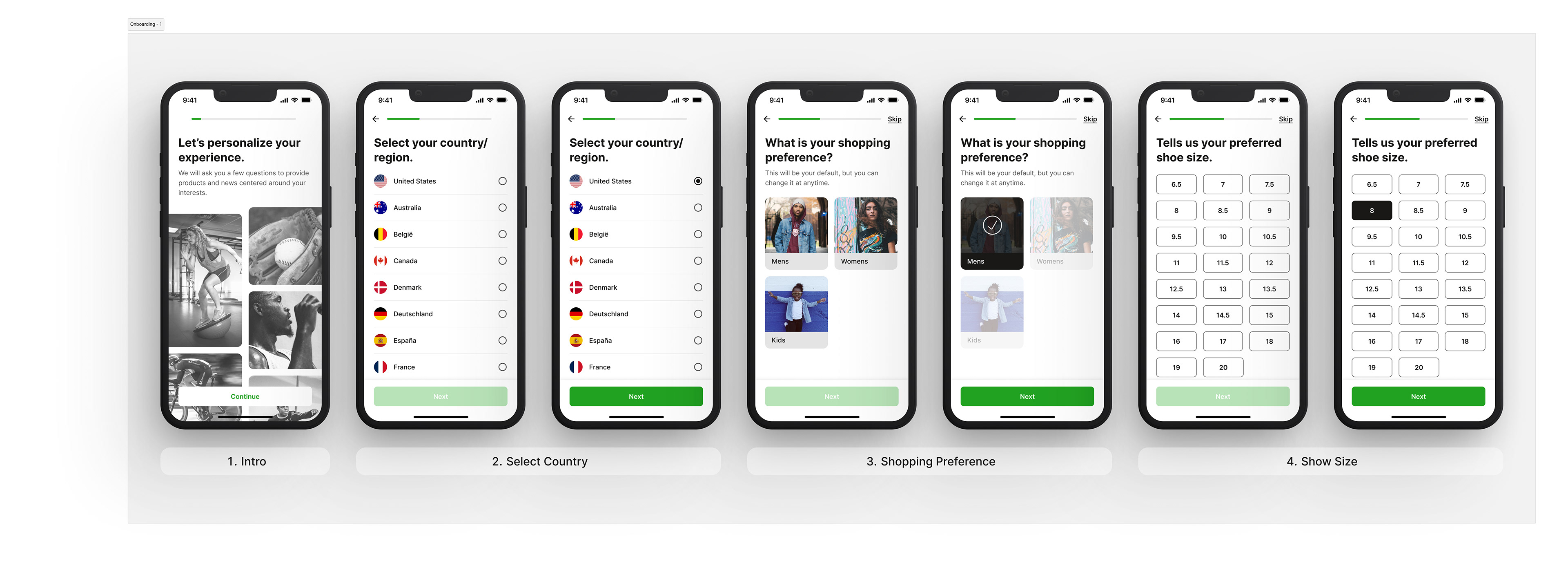
Onboarding Flow Key Screens 1-4

Onboarding Flow Key Screens 5-7


🛍 FEED + STORE
The Feed and Store are the mostly used pages in the app. Feed being content driven. Users can read through upcoming product drops, popular brand/style collections, and curated articles focusing on relevant topics and people who represent the urban athletic culture. While, always being linked toward a product they can purchase within the storefront.
The Storefront is where the user can search and locate everything we have for purchase. The user has multiple ways to search and navigate. We highlight new drops and products on sale, from the typical ones like shoes, apparel, accessories, and even gift cards. The user can also filter their views between gender, kids, sports, and brands. Feature sales are always front and center, so the user is aware of any deals of interest.
From these pages, the user can also cut through to simply searching a specific product by keyword. Based on availability, we ensure to present a visual of the product, and suggested search groups to make sure they user can find what they are looking for.

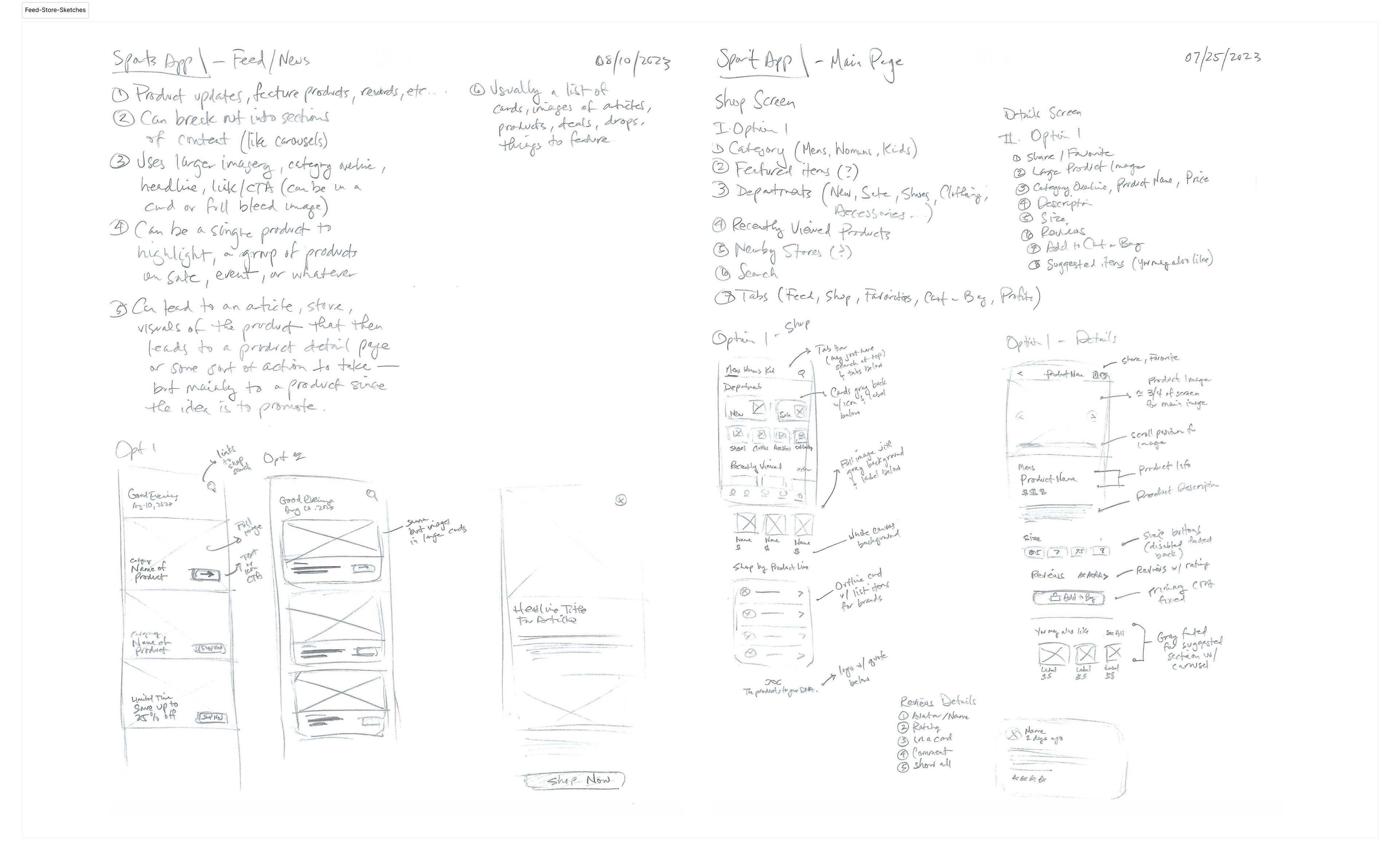
Feed & Store Feature Outline + Sketches

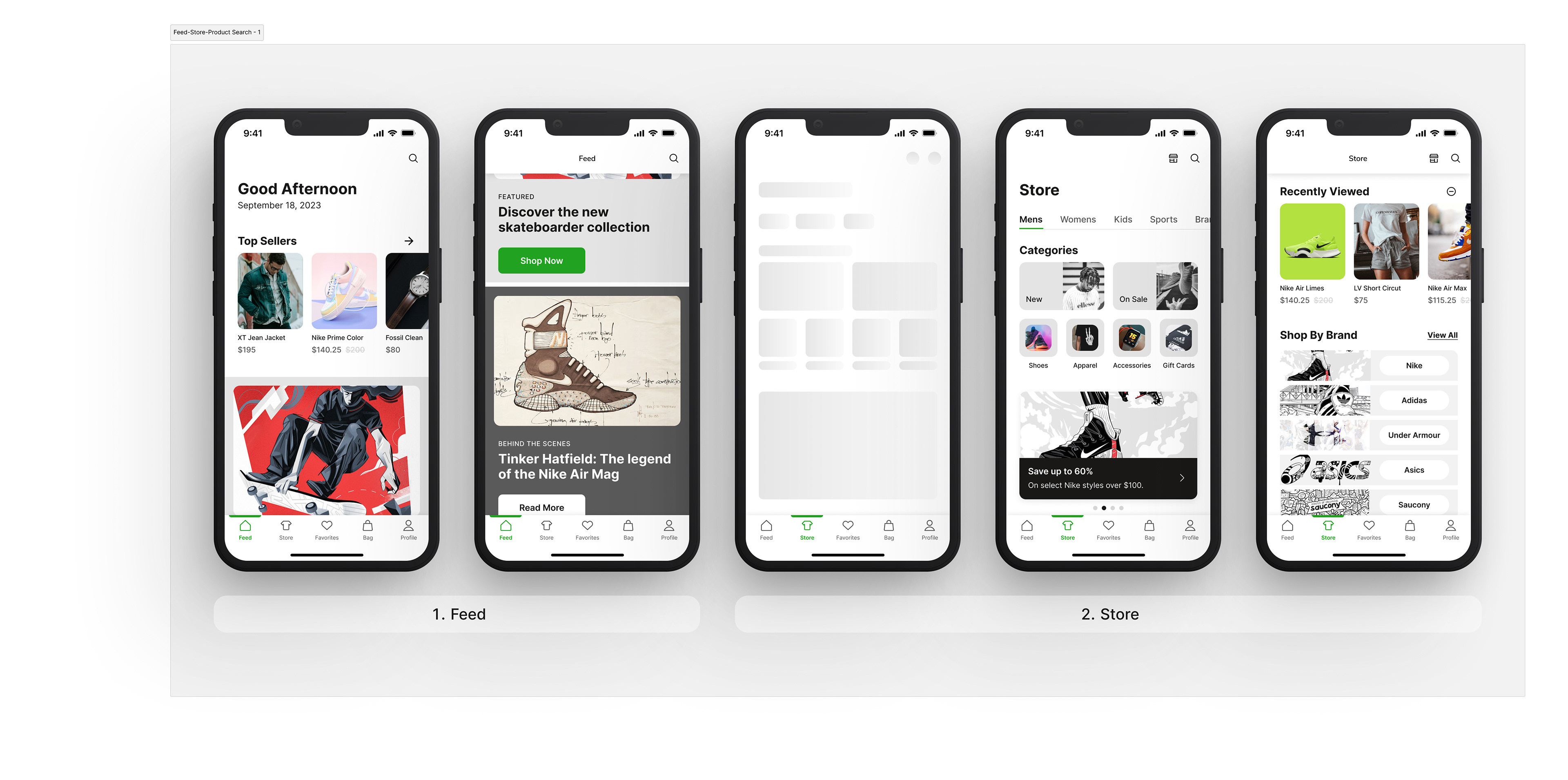
Feed + Store Key Screens

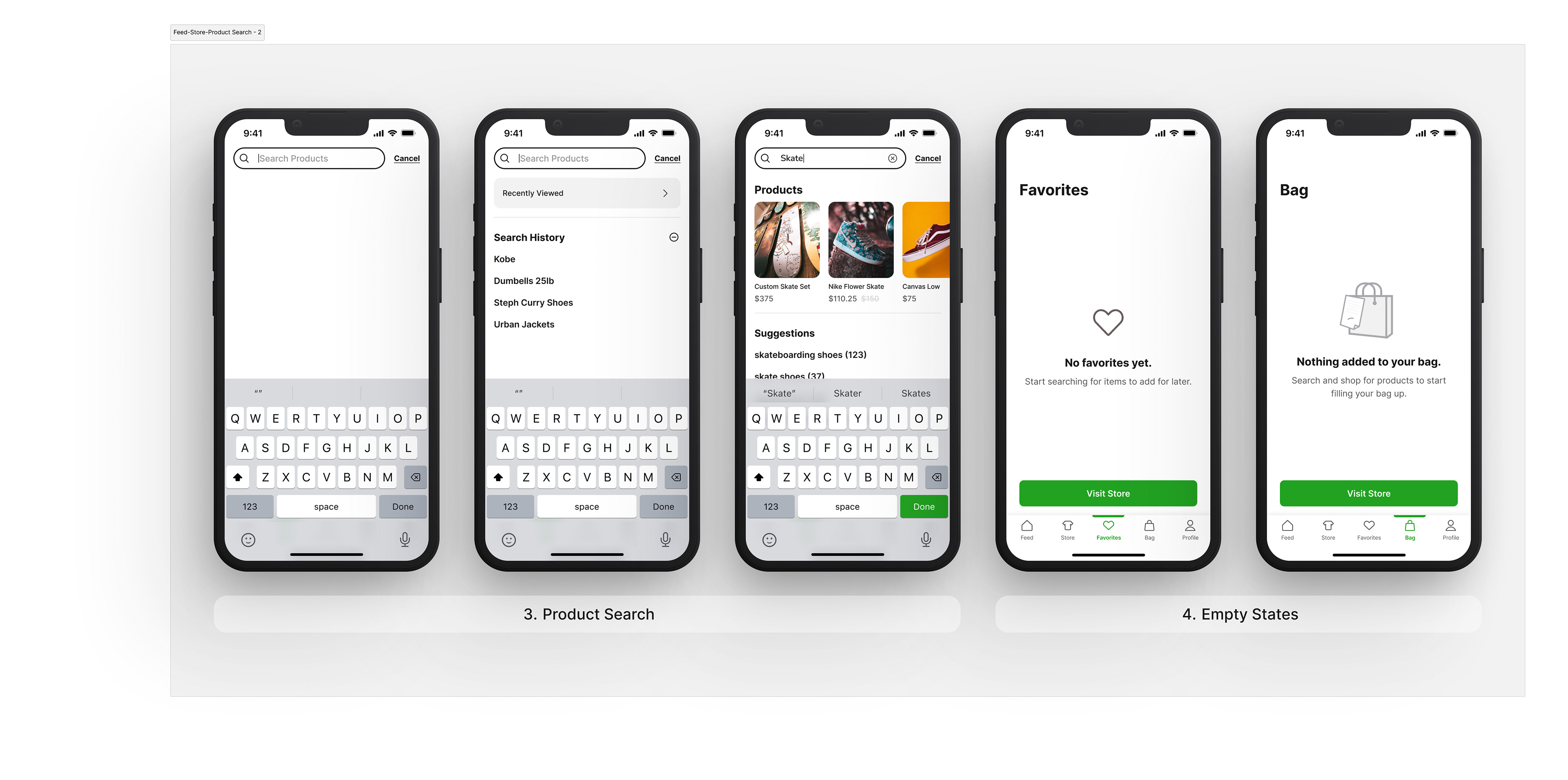
Product Search Key Screens + Empty Page States


🔎 STORE LOCATION SEARCH
Users have an easy way to locate a nearby warehouse to purchase products directly, without having to wait for it to arrive. The search feature prompts for location and/or allows the user to locate based on city, state, or zipcode. As the user types, they system will begin to crawl it's database to display related locations sorted by distance.
Users can then go directly to the location's store page to view details, such as hours—or view an area map to see locations within that region. The system will utilize Apple and Google maps API, which also allows the app to display any saved images if the store has uploaded them.

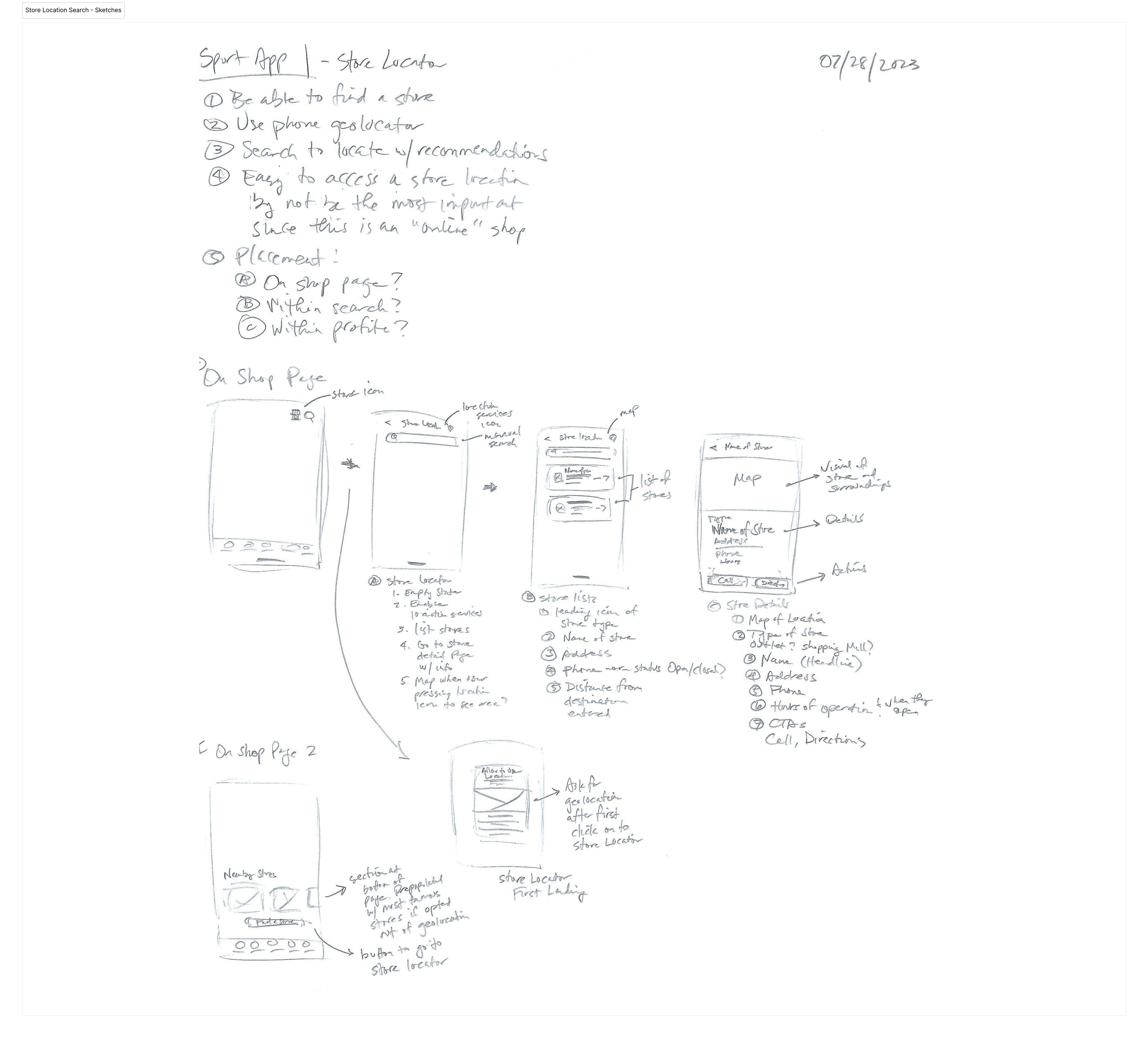
Store Location. Search Feature Outline + Sketches

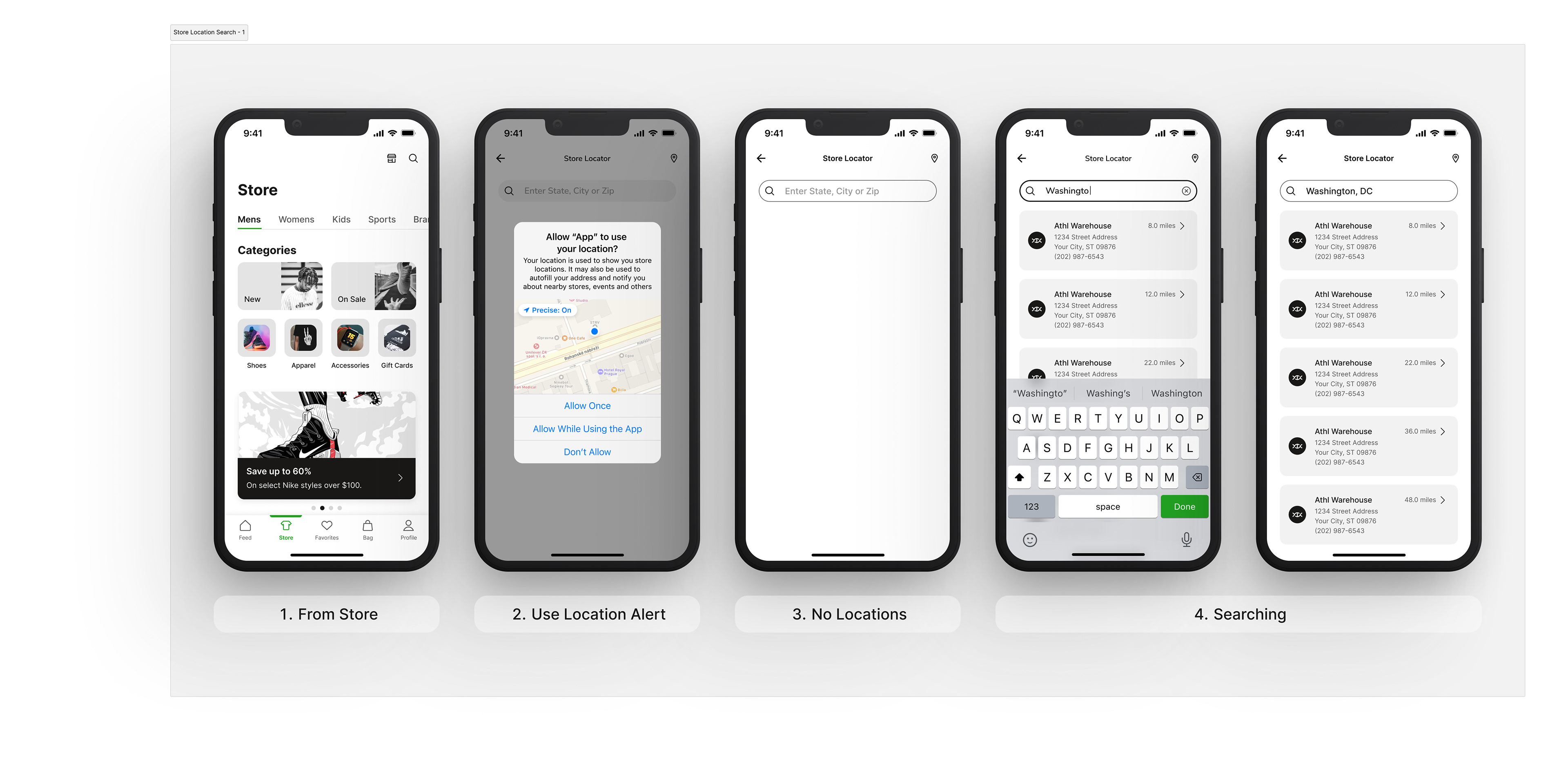
Store Location Search Key Screens 1-4

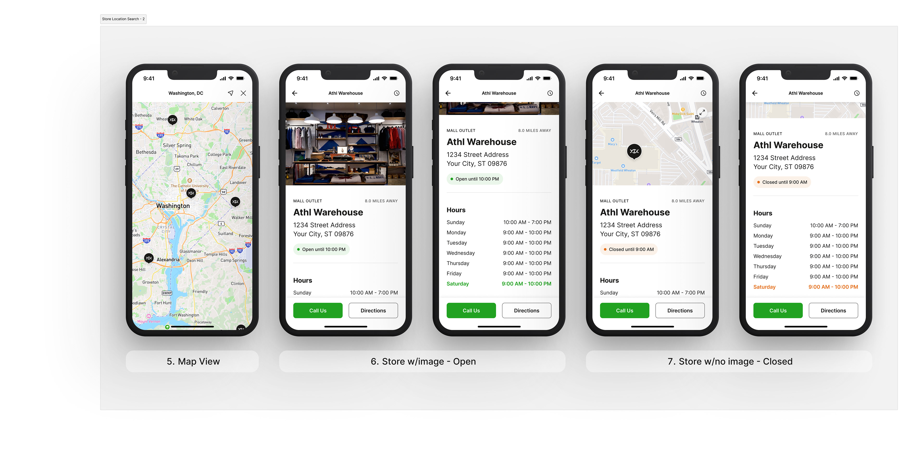
Store Location Search Key Screens 5-7


🛒 CHECKOUT
Probably one of the most important pages within the app. Users can force touch the image card on any higher level page where the product is visible, or navigate to a product's detail page to view and/or begin the checkout experience. The app will default information received from onboarding and display where that information is needed if the user hasn't done so already. The checkout experience has been simplified into a bottom sheet with all of the necessary sections to add and modify.
For first time users, most of these entries will be blank with CTAs to begin the short flow of adding the necessary info, then circling back to the checkout bottom sheet until all necessary information is entered. Users are able to see the item, shipping, payment type, and total breakdown in one easy view prior to purchase.
To ensure the user is clear and doesn't accidentally purchase by mistake, a swipe to page on the purchase CTA has been created. Once everything is confirmed, the user receives a receipt of purchase with the ability to manage or share before exiting. The user will receive email updates and/or notifications if opted in. All purchases will be visible on their Profile page, under "order history".

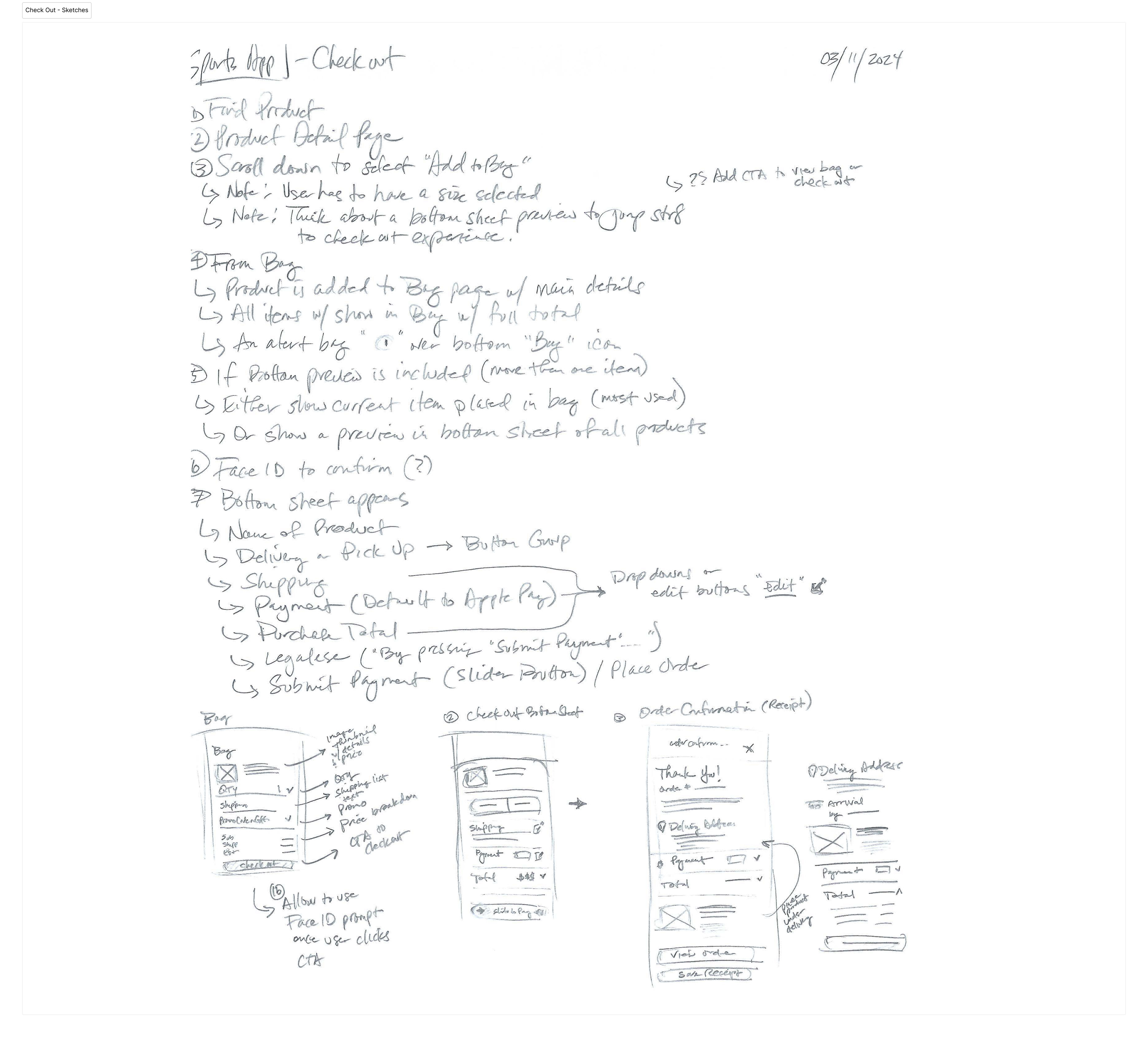
Checkout Feature Outline + Sketches

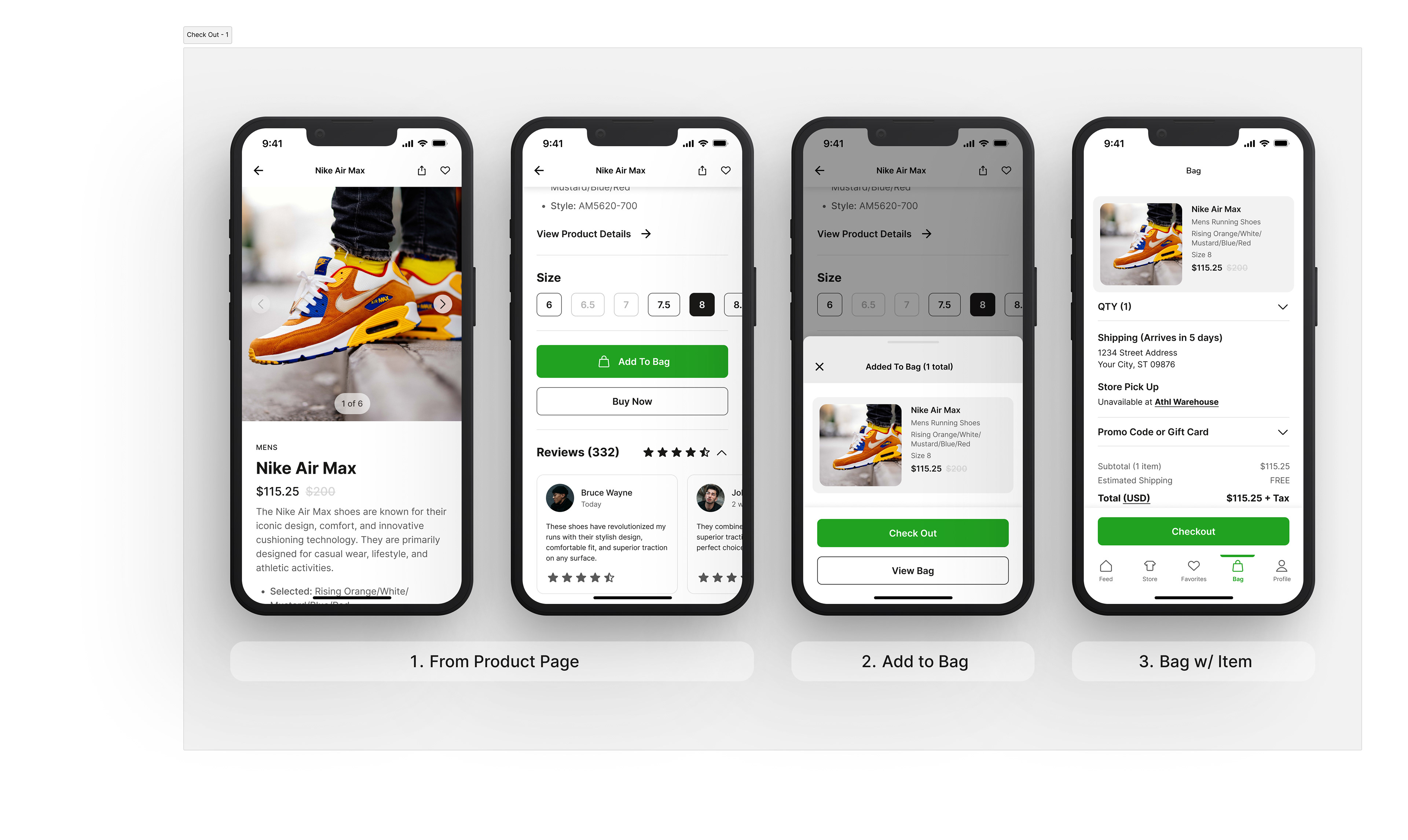
Checkout Flow Screens 1-3

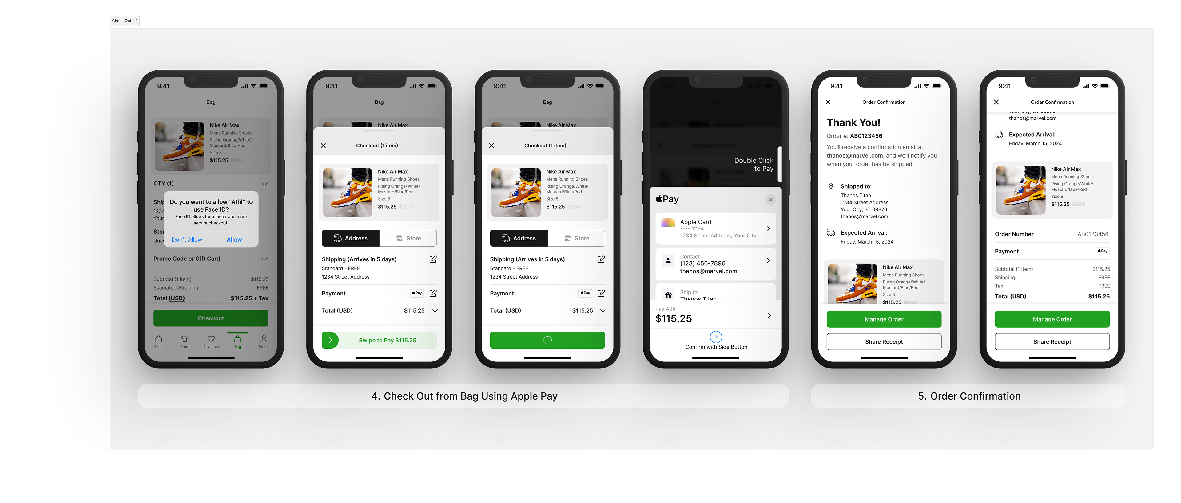
Checkout Flow Screens 4-5


💬 CHATBOT
A fundamental element to help resolve issues, users can engage with the chatbot to begin problem solving anything within the app or product related. If the AI needs to escalate, the human to human interaction begins. Utilizing some of the same algorithms as other sophisticated AI systems, the aim is for the chatbot to be the sole point of contact for resolution.
To be familiar to the user, the interface starts with a suggested set of the most requested and ideal questions—taken from learned engagement within the app and the most requested answers through the app's ecosystem. 

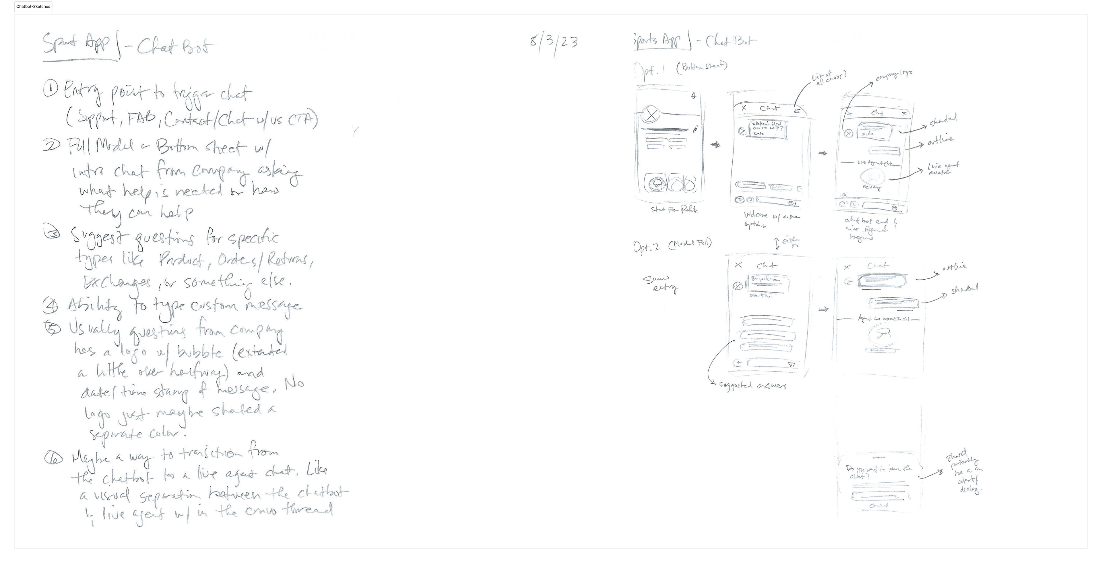
Chatbot Feature Outline + Sketches

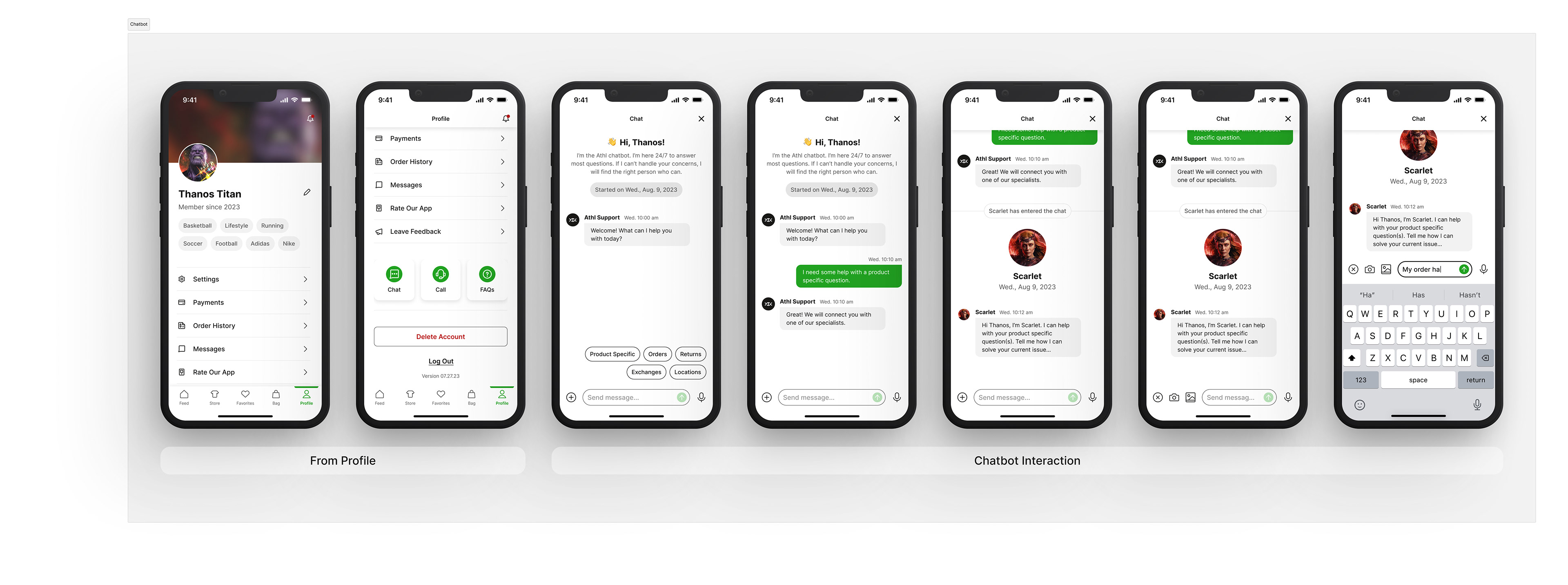
Key screens and interactions from the profile to the chatbot


👆 Click image above to view interactive prototype

🫡 THANKS FOR VIEWING
Back to Top